Key Takeaways:
- Busy does not mean productive
You cannot rely on activity alone. Productivity is about meaningful output, not just hours worked. - Track the right metrics weekly
Reviewing a focused set of workforce metrics every week helps you catch issues early and stay proactive. - Your dashboard should show patterns, not raw logs
Trends like rising idle time or falling productivity matter more than detailed activity tracking. - Avoid reading metrics in isolation
Combining metrics gives you context and helps you identify root causes instead of reacting to surface-level signals. - Balance visibility with trust
Strong workforce analytics gives you clarity without turning into surveillance. Privacy controls and role-based access are essential. - Tie every metric to a decision
Data is only useful if it leads to action. Each metric should help you decide what to fix, improve, or optimize. - Watch for early warning signals
Metrics like burnout hours, declining productivity, or low billable time can reveal risks before they impact performance or revenue. - Focus on utilization and workload balance
Overloaded employees lead to burnout, while underutilized teams signal wasted capacity. Both affect profitability. - Improve data accuracy with automation
Reducing manual time entries improves the reliability of your insights and decision-making. - Use software to bring everything together
A unified workforce analytics dashboard helps you move from scattered reports to a clear, actionable view of your business.
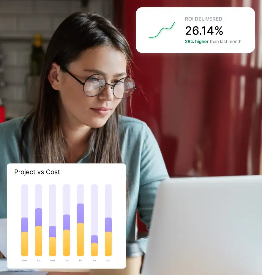
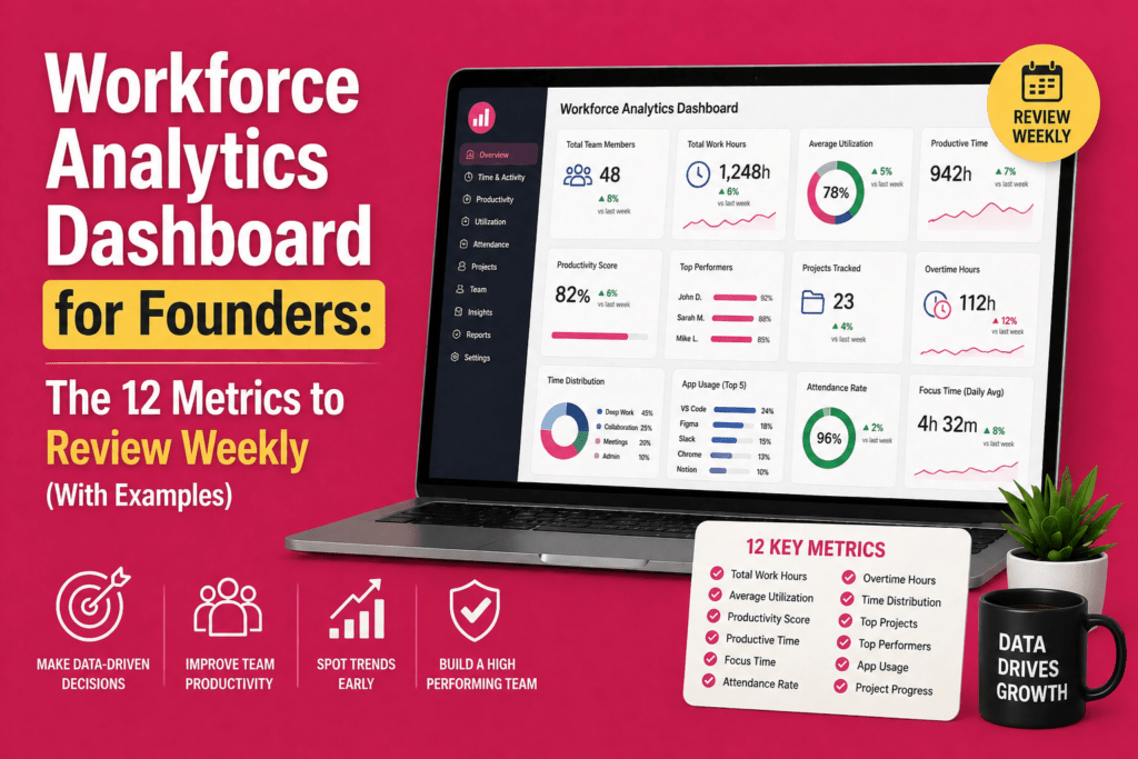
Running a company means making decisions quickly, and your team data should help you do that as quickly as possible. A workforce analytics dashboard gives founders a clear view of how work is flowing across the business, where time is being spent, and where performance may need attention. But not every metric deserves equal attention. The real value comes from tracking the right weekly numbers that help you understand output, efficiency, and team health at a glance.
In this guide, we will walk through 12 essential workforce metrics founders should review every week, with practical examples for each one.
What a Good Workforce Analytics Dashboard Should Look Like?
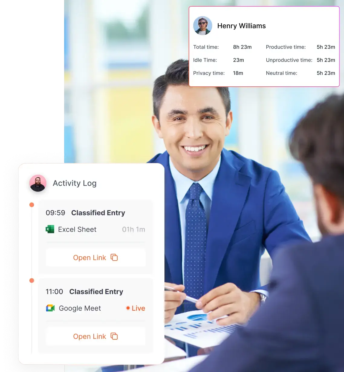
A founder’s dashboard is a place where team performance, capacity, and efficiency come together in one clear view. The best dashboards give you team-level visibility while still protecting privacy through the right controls. For example, strong platforms can help you distinguish active time from idle time, track app usage, and review break durations, while role-based access ensures only the right managers can see individual-level details.
Move from logs to patterns
You do not need a record of every task, website visit, or action. That kind of detail creates noise, not clarity. What you actually need is a view of trends, such as rising idle time, falling productive hours, or repeated late starts. When your dashboard highlights exceptions and alerts you only when metrics move beyond a set threshold, you can focus on what truly matters. Over time, this helps you build a sharper sense of which patterns need attention and which ones are simply part of normal work.
Connect metrics to decisions
Data on its own does not improve performance. The value comes from using that data to make better decisions. Your dashboard should help you decide when to reallocate work, coach a team member, adjust staffing, or revisit software licenses. Every metric should point you toward an action, so you are not left trying to figure out what the numbers mean on your own.
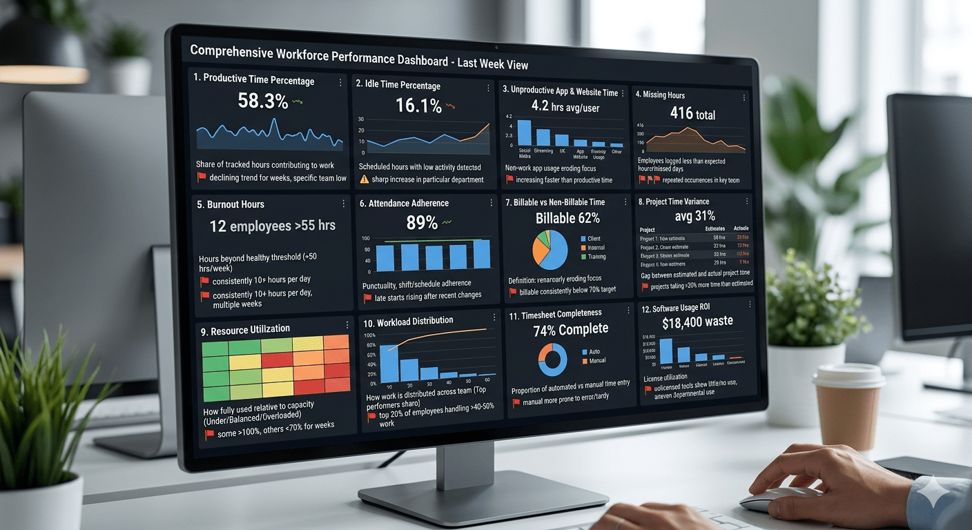
The 12 Workforce Metrics That Should Be Present In Your Workforce Analytics Dashboard
Many founders assume that busy schedules translate to productive teams. However, workforce‐productivity experts observe that real productivity is the ratio of meaningful output to input. You can be efficient without being productive if tasks are low value or poorly prioritized. Looking at the right metrics helps you distinguish between activity and impact.
That is why you need to look at the right workforce metrics each week. They help you separate activity from impact, so you can understand whether your team is actually moving the business forward.
Here are 12 workforce metrics that help you track performance and spot issues early:
1. Productive time percentage
What it means: The share of tracked hours categorized as productive or task‑related. Unlike raw hours, this metric shows how much time actually contributes to meaningful work.
Why you should care: Low productive time suggests employees are spending too much time on administrative tasks, meetings or distractions. EmpMonitor notes that productivity is about maximizing valuable output, not just efficiency.
Red flag: Productive time declining for consecutive weeks, or significantly lower in one team than others.
Example: Your 40‑person customer success team logs 1 600 hours in a week, but only 58 % counts as productive, down from 65 % the previous week.
What to do next: Look for meeting overload, process bottlenecks or unclear priorities. Consider automating repetitive tasks and clarify what counts as productive work.
2. Idle time percentage
What it means: The proportion of scheduled hours where no activity or only very low‑level activity is detected.
Why you should care: Rising idle time can signal blockers, unclear task assignments or disengagement. CurrentWare points out that tracking active vs idle time reveals whether employees are present and actually working.
Red flag: A sharp increase in idle time in a particular department or after a process change.
Example: Idle time jumps from 8 % to 16 % for your marketing team after a new approval workflow is introduced.
What to do next: Investigate the workflow. Ask whether tasks are waiting for approvals, whether tools are clunky or whether employees lack the skills to move forward. Offer training or streamline the process.
3. Unproductive app and website time
What it means: Time spent on applications or websites that are unrelated to work during scheduled hours. This metric goes beyond idle time to highlight active distractions.
Why you should care: A small amount of personal browsing is fine, but large spikes can erode focus and payroll efficiency. The key is to distinguish between necessary research (e.g., competitor sites) and true time‑wasters.
Red flag: Non‑work app usage increasing faster than productive time or concentrated in specific teams.
Example: On Friday afternoons, several customer service reps spend an extra two hours on social media apps. The result: they miss response‑time targets.
What to do next: Revisit Friday scheduling—are tasks winding down early? Offer an end‑of‑week recap meeting or assign short, engaging projects. Reinforce company policies on acceptable use without overpolicing.
4. Missing hours
What it means: The number of employees whose logged time falls below expected hours or who miss entire days without leave. Attendance metrics go beyond start/stop times to capture absenteeism trends.
Why you should care: Chronic lateness or unlogged time can indicate disengagement, burnout or personal issues. Missing hours also distort capacity planning and billable projections.
Red flag: A cluster of missing hours in a team or repeated occurrences by the same individuals.
Example: Twelve employees record fewer than 35 hours in a week where the expectation is 40. Interviews reveal that manual time entry is cumbersome, leading to unreported work.
What to do next: Confirm whether hours were actually worked but not recorded or whether genuine absences occurred. Automate time capture where possible and remind teams of reporting requirements. For persistent absenteeism, discuss underlying issues with the individuals.
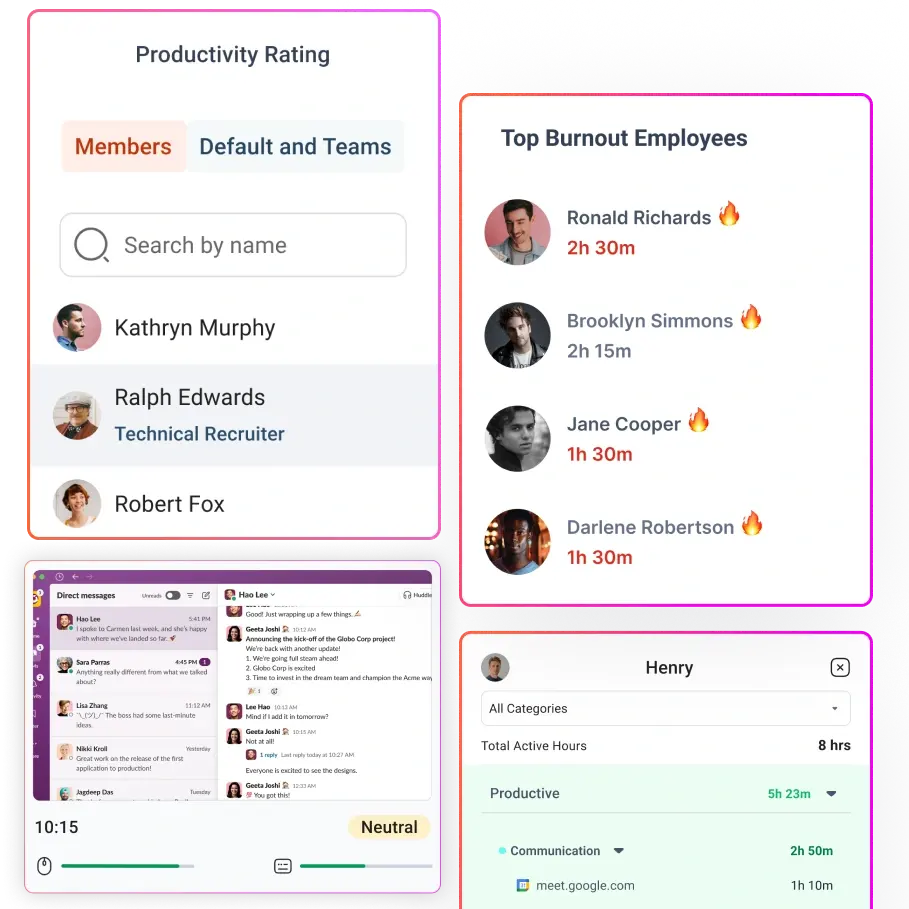
5. Burnout hours
What it means: Hours worked beyond a healthy threshold (for example, more than 50 hours per week) or consecutive days without sufficient breaks. Burnout metrics may also include surveys or wellness scores.
Why you should care: Nearly half of the world’s employees report feeling burned out. Chronic stress erodes motivation and creativity and doubles the risk that employees will leave. High utilization rates are often linked to burnout.
Red flag: Individuals consistently logging 10 + hours per day or crossing your company’s burnout threshold for multiple weeks.
Example: A senior engineer records 55–60 hours per week for three weeks straight while also leading recruitment interviews. Her output remains high, but she begins making more mistakes and missing meetings.
What to do next: Redistribute tasks, delay less urgent projects and encourage time off. Ask whether she feels overwhelmed or lacks support. Consider implementing alerts that warn managers when someone’s hours exceed the healthy range.
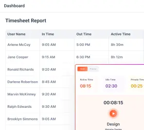
6. Attendance adherence
What it means: How closely employees follow their expected schedules. This includes punctuality, shift adherence and adherence to agreed working hours.
Why you should care: For customer‐facing or shift‑based roles, lateness and no‑shows hurt service quality. Even in knowledge work, repeated late starts can signal disengagement. Attendance data should be linked with performance metrics to avoid overvaluing mere presence.
Red flag: Late starts rising after a schedule change or in one department. Frequent unscheduled absences.
Example: After moving to a hybrid schedule, your support team sees a 22 % increase in late logins. Ticket resolution times slip, causing customer complaints.
What to do next: Clarify expectations for start times and breaks. Ensure hybrid policies are well communicated. Consider flexible hours if roles allow, but pair them with clear productivity targets.
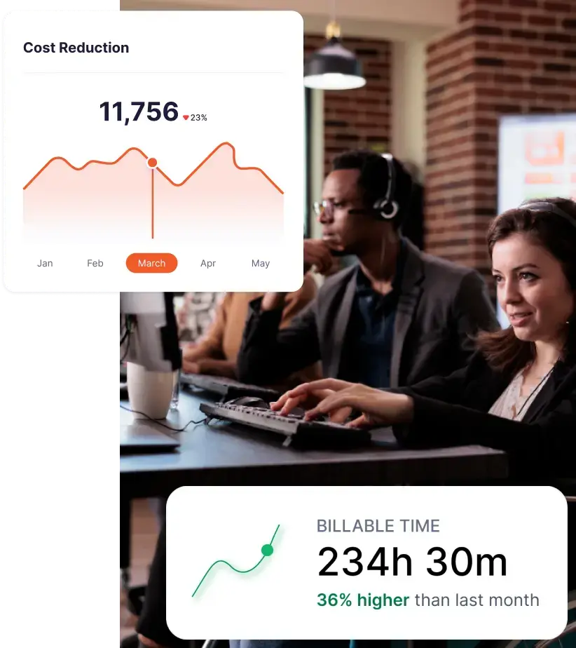
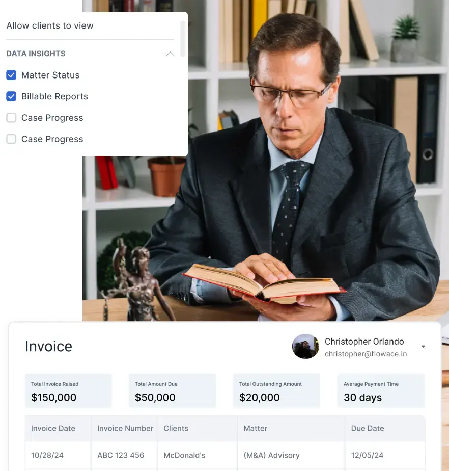
7. Billable vs non‑billable time
What it means: The proportion of working hours that can be invoiced to clients versus time spent on internal activities.
Why you should care: For professional services and agencies, billable utilization ties directly to revenue. NetSuite defines utilization rate as the percentage of available employee time spent on billable work. High utilization must be balanced with sustainability.
Red flag: Billable time consistently below your target (for example, 70 % in consulting). Sharp declines in billable time for specific teams.
Example: Your consulting team logs 38 % of its time as non‑billable internal meetings and training in a week when it should be above 60 %. Meanwhile, billable work backlogs grow.
What to do next: Audit internal meetings; cancel or shorten those that don’t drive client work. Invest in better onboarding materials so training isn’t done ad hoc during billable hours. Reevaluate staffing levels if teams are overbooked on non‑billable initiatives.
8. Project time variance
What it means: The gap between estimated time and actual time spent on projects or tasks. It helps you spot scope creep or inaccurate planning.
Why you should care: When projects routinely go over estimates, profitability suffers and client trust erodes. Weekly reviews let you detect overruns early.
Red flag: Projects consistently taking 30 % or more time than estimated. Certain project types or teams always exceeding estimates.
Example: Onboarding a client’s marketing campaign is scoped at 24 hours but consumes 37 hours. The variance occurs because content approvals take longer than expected.
What to do next: Adjust future estimates based on actuals. Create a buffer for client feedback. Meet with the team to understand obstacles and revise process guidelines.
9. Resource utilization
What it means: How fully each team member or team is being used relative to their capacity. NetSuite notes that utilization data reveals who is overloaded and who has time to spare. It also ties workforce output to profitability.
Why you should care: Underutilization suggests wasted capacity or weak demand, while overutilization signals potential burnout and missed billables. Balanced utilization maximizes profit without harming wellbeing.
Red flag: Some employees consistently over 100 % of capacity while others are below 70 %. Utilization far above your target (for example, 90 % or more) for multiple weeks.
Example: Two account managers are overloaded at 110 % utilization, while another is at 50 % because his clients paused projects.
What to do next: Reassign accounts to balance workload. Use utilization reports to justify hiring or cross‑training. Recognize that extremely high utilization can lead to burnout.
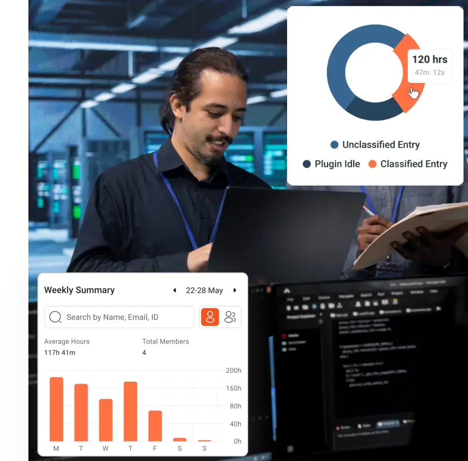
10. Workload distribution
What it means: A view of how work is distributed across your team—who handles the majority of tasks, who has spare capacity and whether roles align with responsibilities.
Why you should care: Unequal distribution creates bottlenecks, resentment and turnover risk. Top performers may carry an unfair share of the load, leading to burnout; underused employees may become disengaged.
Red flag: The top 20 % of employees handling more than 40–50 % of work. Repeatedly overloaded employees.
Example: In your product team, three engineers handle 60 % of development tasks while others pick up less critical work. Meanwhile, those three engineers report burnout hours.
What to do next: Adjust task assignments based on skill and availability. Provide training or pairing to bring underutilized team members up to speed. Recognize and reward top performers while preventing unsustainable loads.
11. Timesheet completeness / manual time dependency
What it means: The proportion of hours automatically captured versus manually entered. Manual time entries are more prone to errors and omissions.
Why you should care: Incomplete timesheets undermine data integrity, making it hard to trust utilization, billable hours and capacity planning. High manual entry suggests employees are still logging time after the fact, which may be inaccurate or tardy.
Red flag: A team manually enters more than 25 % of its hours. Frequent missing entries or late submissions.
Example: Field technicians log 30 % of their hours manually because they work offline. As a result, their utilization looks low and payroll is delayed.
What to do next: Provide offline time‑tracking tools that automatically sync when devices reconnect. Simplify manual entry forms. Educate employees on why timely, accurate timesheets matter and how incomplete data hurts planning.
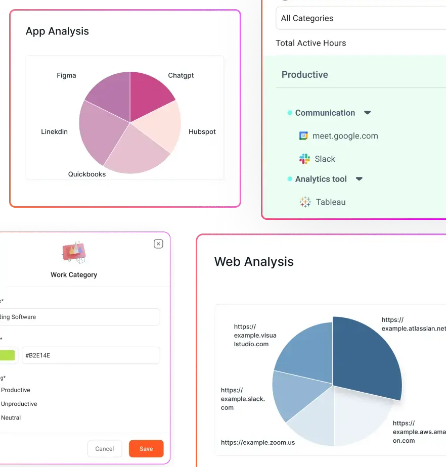
12. Software usage ROI
What it means: Whether the tools you pay for are actually used. CurrentWare’s research suggests that nearly 48 % of software spending is wasted due to unused or underutilized licenses. Without usage analytics, organizations overspend on tools that deliver zero value.
Why you should care: Software is often one of your largest operational expenses. Unused seats drain budget and indicate misaligned workflows. Usage metrics help you renegotiate licenses, consolidate tools and free up funds.
Red flag: A licensed tool shows little or no active use for multiple users. Departmental usage is uneven or plummeting.
Example: Your design tool is licensed for 14 users, but only five log meaningful hours each week. Others switched to alternative tools without telling IT. Annual renewals are due next month.
What to do next: Audit license usage before renewal. Reduce seat counts or move to a usage‑based plan. Train teams on how to use the tool effectively or migrate to a better‑fit alternative. Put in place a process to reclaim licenses when employees leave.
How to Read a Workforce Analytics Dashboard Without Looking at Metrics in Isolation
You should never read a single workforce metric on its own. One number can be useful, but it rarely tells the full story. The real insight comes when you compare related metrics and look for patterns that explain what is actually happening on the ground.
A workforce analytics dashboard becomes far more powerful when you compare metrics instead of viewing them alone. This approach helps you identify real issues and make smarter decisions.
For example:
High productive time and high burnout hours
This usually means you have strong performers who are delivering value, but at an unsustainable pace. They may be carrying too much load and could burn out if the pattern continues.
High attendance and low productivity
This suggests people are showing up, but the work is not translating into meaningful output. In that case, you may need to look at goal clarity, distractions, or weak prioritization.
Low idle time and low billable hours
This often means your team is busy, but not on revenue-generating work. You may need to examine how much time is going into internal tasks versus client work.
Low missing hours and high manual time
This can make timesheets look complete, but it may also mean the data depends too heavily on manual entries. That can hide gaps or reduce accuracy.
When you review metrics in pairs, you avoid jumping to conclusions. You start seeing the root cause behind the number, which leads to better decisions and a much clearer view of team performance.
How You Can Use Workforce Analytics Software to Lead More Effectively
A workforce analytics software helps you move from guesswork to clarity. Instead of pulling updates from separate attendance reports, timesheets, project trackers, and manager check-ins, you get one place to see how work is actually happening across your business. You can quickly understand where time is being spent, which teams are overloaded, where productivity is slipping, and whether your payroll hours are translating into meaningful output. That matters because founders do not just need more data. You need data that helps you make faster, better decisions.
A strong workforce analytics dashboard also helps you spot problems before they become expensive. For example, if productive time falls while attendance stays high, you know the issue is not presence but performance. If billable hours drop while non-billable work rises, you can catch margin leakage early. If burnout hours increase for the same high performers week after week, you can intervene before that turns into attrition, errors, or delivery delays. In other words, workforce analytics software helps you connect people data to business outcomes like profitability, execution speed, and team health.
Just as importantly, the right software helps you do this without micromanaging. Modern platforms can show trends, alerts, and workload patterns instead of forcing you to review raw logs all day. They can also balance visibility with trust through privacy controls, role-based access, and smarter categorization of productive, unproductive, idle, and task-related time.
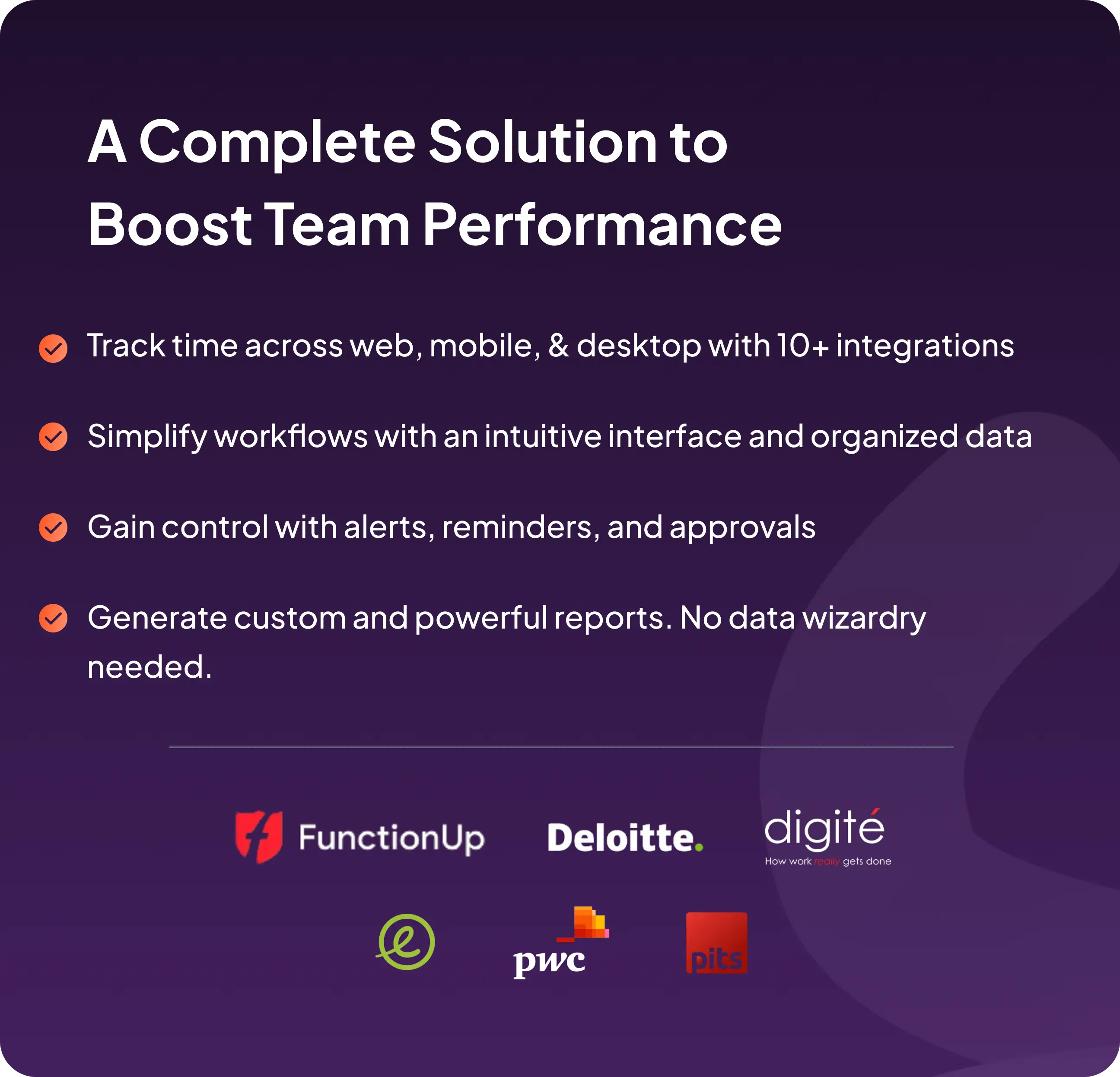
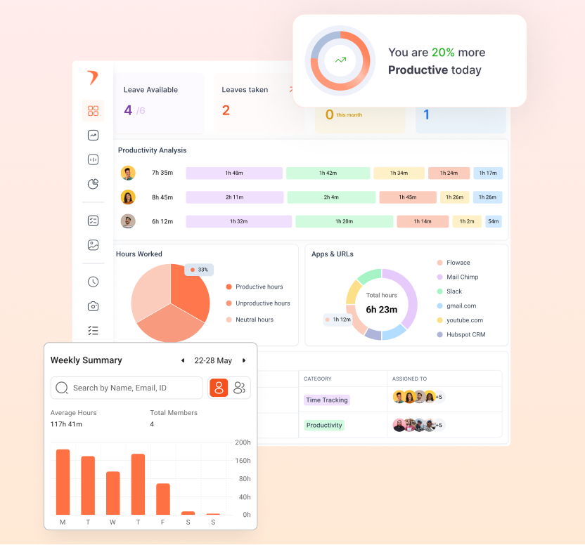
Flowace fits well into this founder use case because it combines AI-powered time tracking, attendance tracking, app and website monitoring, productivity insights, automatic timesheets, project tracking, work-life balance metrics, alerts, and privacy mode in one platform. That gives you a cleaner weekly view of what needs attention, what is working, and where you should take action next.
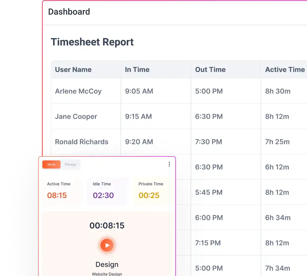
How Flowace Helps You Review All 12 Metrics in One Place
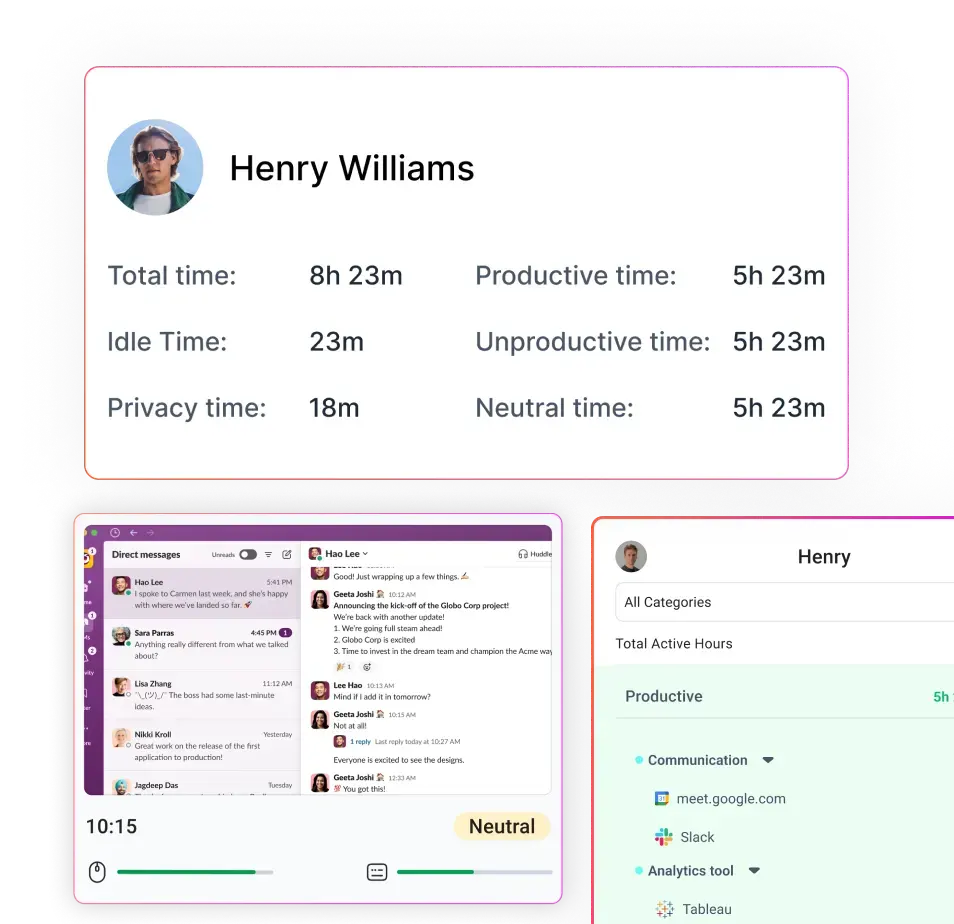
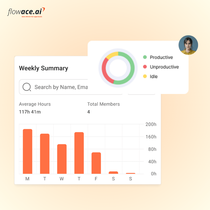
Flowace brings your most important workforce metrics into one clear, founder-friendly view, so you do not have to piece together updates from multiple tools or reports. It automatically tracks work time, separates productive and unproductive activity, and helps you see the difference between focused task work and time lost to distractions or context switching.
With Flowace, you can review team-level and individual-level insights on productive time, idle time, missing hours, attendance adherence, burnout risk, workload balance, and billable versus non-billable time from a single dashboard. You can also track app and website usage to understand where time is going and whether your software stack is actually supporting output.
- Automatic time tracking: You can see how work hours are actually spent without relying only on manual entries.
- Productive, unproductive, and neutral time categorization: It helps you understand output quality, not just hours logged.
- Team and individual dashboards: Its for reviewing workforce trends at both a high level and a detailed level.
- Idle time tracking: You can spot blockers, disengagement, or workflow inefficiencies early.
- Attendance tracking: It includes clock-in, clock-out, timelines, and timesheets for better visibility into adherence and availability.
- Automatic timesheets: These reduce manual reporting effort and improve data accuracy.
- App and website usage monitoring: To show where time is going and which tools support or reduce productivity.
- Productivity reports and visualizations: These reports help you analyze patterns, trends, and breakdowns across employees and teams.
- Project and task tracking: To compare estimated vs actual time and review work by project.
- Privacy mode/work mode: To balance visibility with employee trust and avoid a surveillance-heavy experience.
- Historical data and performance trends: It helps you spot patterns over time instead of relying on one-week snapshots.
- Custom alerts and notifications: For issues like late start, idle time, high productivity, unproductive behavior, and burnout.
These features make it easier for you to spot overloaded employees, underused capacity, and early warning signs before they affect delivery, payroll efficiency, or team health. At the same time, features like privacy mode and role-based access help you maintain transparency and trust, so visibility does not turn into micromanagement.
Final Takeaway
Your workforce is one of your largest investments and biggest sources of competitive advantage. Relying on gut feelings or monthly HR reports leaves too much to chance. By reviewing these twelve core metrics every week, you’ll gain a clear picture of where time and money go, where teams are overloaded or underutilized, and where your business may be leaking value. The right workforce analytics dashboard helps you act quickly to improve efficiency, protect margins and support your people.
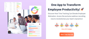
If you a looking for a comprehensive workforce analytics software that brings these metrics together in a single dashboard, give Flowace a try. Book a demo or start your 7-day free trial to see how your team is really performing.
FAQs
What is a workforce analytics dashboard?
A workforce analytics dashboard is a visual tool that brings together key employee performance metrics—productive time, idle time, attendance, workload balance, utilization, billable hours and burnout risk—into one view. It helps founders see how time is spent and where intervention is needed.
What metrics should founders review every week?
Founders should review productive time, idle time, unproductive app usage, missing hours, burnout hours, attendance adherence, billable vs non‑billable time, project time variance, resource utilization, workload distribution, timesheet completeness and software usage ROI.
How is workforce analytics different from attendance tracking?
Attendance tracking records who is present and when, while workforce analytics shows how time is used, where output is slipping, who is overloaded and which tasks drive revenue. Attendance is one input; analytics turn it into actionable insight.
How often should founders review workforce metrics?
Weekly. Continuous analytics enable earlier detection of workforce risks. Monthly or quarterly reviews miss early warning signs.
What makes a good workforce analytics tool for founders?
Look for automatic time tracking, utilization and workload dashboards, billable tracking, burnout alerts, and privacy‑friendly design. The tool should turn activity data into weekly insights and actionable recommendations.