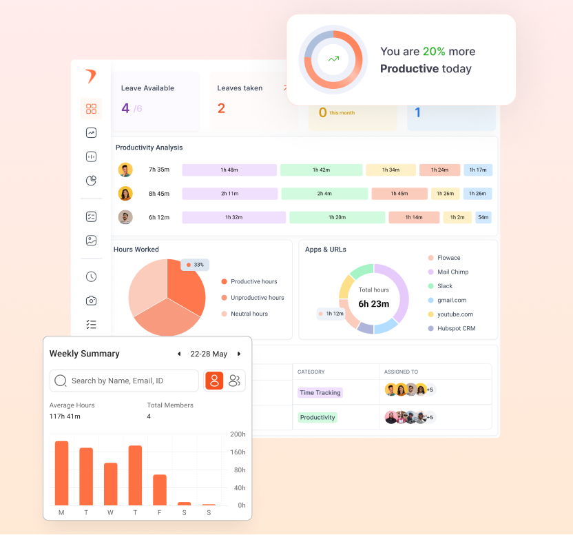
Workforce analytics software that turns captured hours into reclaimed capacity
Find the hours you are already paying for and not using, in reports your delivery lead, your CFO and your client will all accept. Every report is listed below, with real pricing.
Every vendor claims to surface utilization. Almost none publish the arithmetic, so you cannot tell whether their number and your finance team's number will ever agree. Here is one person, one eight-hour shift, start to finish.
An agent records app and website activity, focus time, idle time and time away from system. Nobody fills in a timesheet and nobody starts a timer, which is the only version of this that survives a busy week.
Zero manual timers or timesheets
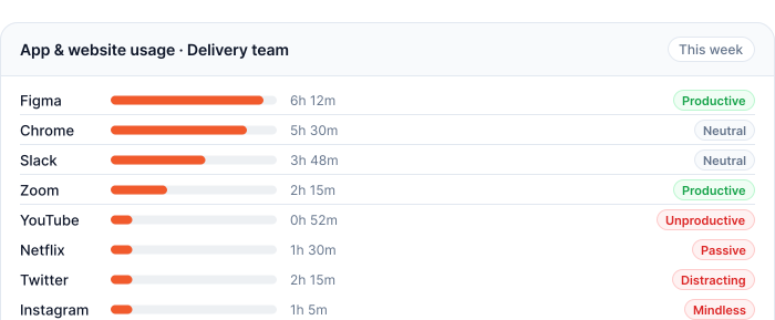
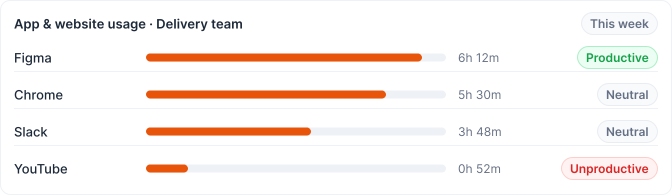
App and website activity ranked by time on task
Filterable by person, team or date
Away time and idle time above a threshold you set come out of the total. Say 42 minutes idle and 25 away. You set the threshold rather than accepting ours, because a five-minute default flags every engineer reading a spec and twenty minutes flags almost nobody.
Idle threshold configurable, with a per-team override
Away time kept separate from idle, not merged
Internet outages logged separately again, so a connection drop is not read as idling
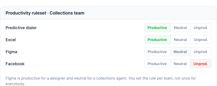
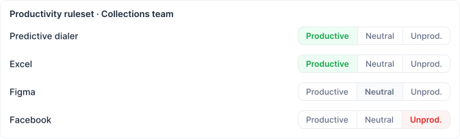
Apps are classified productive, unproductive or neutral under your own ruleset, so Figma is productive for a designer and neutral for a collections agent. Neutral 48 minutes, unproductive 45. This is the single strongest predictor of whether anybody still opens the report in month six.
Three values only: productive, unproductive, neutral
One ruleset per team, not one for the whole organization
Custom categories on top, so you report on queues, engagements or matters
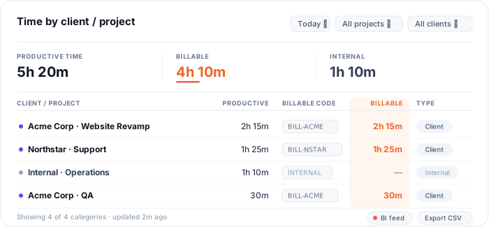
Productive time maps to projects, clients, matters or queues through your own categories, which is the step that turns a percentage into a currency figure. Of the productive time, 4h 10m carries a billable code and 1h 10m is internal.
Your categories, in the language your operation already uses
Internal time separated from client time
CSV on every report and a direct feed into your BI tool
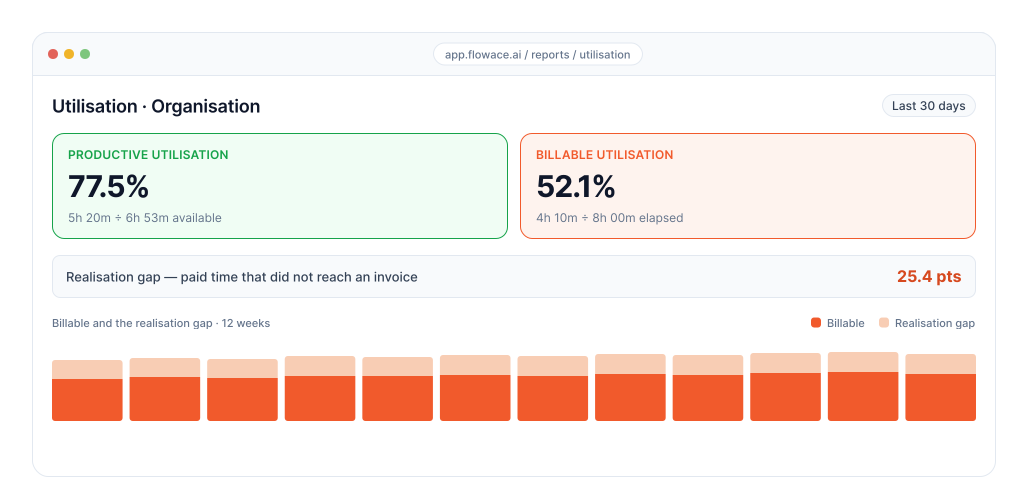
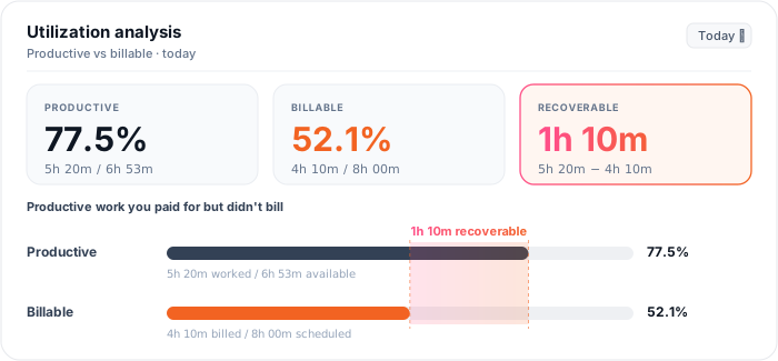
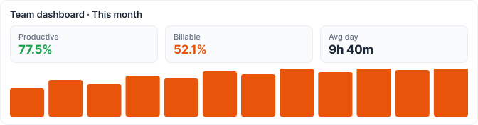
Productive utilization is 5h 20m over 6h 53m, or 77.5 per cent, and it tells a delivery lead the day was well used. Billable utilization is 4h 10m over 8h 00m, or 52.1 per cent, and it tells a CFO that just over half the day reached an invoice. The 25.4 points between them is your realization gap, and on a 100-person team it is the largest recoverable number in the business.
Both denominators published, so finance can reconcile them
The realization gap shown as a number, not implied
Most arguments between operations and finance are two people quoting different denominators
Workforce analytics reports
Eight reports, each ending in a decision you can act on
Every card leads with what you gain. The report name sits in the eyebrow so you can still find it.
You get a ranked list of every application and site by time on task, filterable by person, team and date. Renewal conversations start from evidence instead of a guess, and the tools your team genuinely lives in stop being confused with the ones finance is still paying for.
You set the threshold rather than accepting ours. A five-minute default flags every engineer reading a spec. Twenty minutes flags almost nobody. The number your managers see becomes one they will defend rather than dispute.
Time away from system is kept separate from idle time, and internet outages are logged separately again. On a distributed floor that one distinction is the difference between a utilization figure you can put in a client review and one you quietly bin.
You classify every app as productive, unproductive or neutral, per team. Figma is productive for a designer and neutral for a collections agent. This is the single strongest predictor of whether anyone still opens the report in month six.
You build your own categories on top of the productive split. A contact center builds queues. An accounting practice builds engagements. A law firm builds matters. The same capture produces a report each operation recognizes without translation.
Individual, team and organization views, configurable widgets, CSV on every report and a direct feed into your BI tool. Nobody rebuilds the monthly deck by hand again.
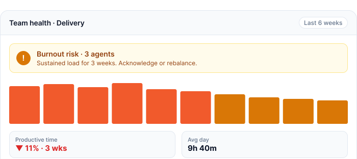
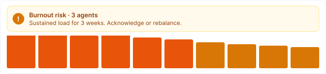
Alerts fire on burnout risk, sustained productivity decline and forming trends, without you defining a threshold for each one first. You find out in week two rather than in an exit interview.
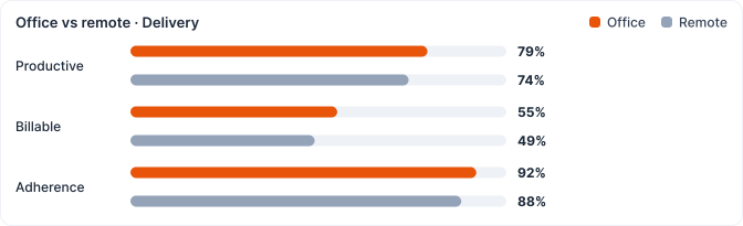
The same capture and the same classification, split by work location. The conversation stops being about opinions and starts being about two comparable numbers. Available on Premium.
Workforce analytics software comparison
Flowace vs other workforce analytics software
Simple per-user pricing. Every plan includes attendance, projects & tasks, silent tracking, and support.
Feature
Flowace
Most other workforce analytics tools
The tier where workforce analytics switches on
Standard, $4 per user
Gated to a $10 to $17 tier, or sold as a separate add-on
What utilization, alerting and a year of history cost together
One price, $4
Three line items. $11 to $20 per user per month once stacked.
Data retention included as standard
1 year on every tier
7 days to 6 months, with more history sold as an add-on
Activity log frequency
Published, 1 second
Not published by any of them
Who defines what productive means
Each team sets its own ruleset
One global ruleset for the whole organization
Utilization arithmetic
Both denominators published, productive and billable
The number is shown, the calculation is not
Connectivity failure
Logged separately from idle time
Absorbed into idle, so remote teams read worst
Employee opt-out
Privacy Mode, nothing captured at all
Restriction rather than removal: masking, roles, schedules
Recover bench time and lift billable utilization Report on utilization, billability, bench time against capacity, resource allocation and project profitability, with effort variance between estimated and actual on every project. Time on task rolls up to the utilization figure your account reviews are built on.
Cut shrinkage against budget and hold adherence Report on shrinkage split planned against unplanned, schedule adherence, occupancy, AHT against wrap time, absenteeism and cost per transaction. Time on system and time away from system are captured separately, which is what makes adherence defensible in a client review.
Raise coder throughput without losing accuracy Report on per-case and per-claim time, turnaround time against SLA, productivity against accuracy, and capacity reclaimed across the coding floor. HIPAA posture is covered in the security review.
Close the gap between hours worked and hours billed Report on billable hours, realization rate, per-client profitability, turnaround time and timesheet accuracy. Write-off rate by preparer is the number partners ask for first.
Recover the billable hours your timekeeping is losing Report on time per matter, matter profitability, realization rate and timesheet accuracy against captured time. The six-minute increment convention is respected in the export.
Workforce analytics is the practice of using work activity data to answer operational questions about capacity, cost and load. It runs on three inputs: activity data showing what people did on their machines, time and attendance data showing presence and shifts, and business system data showing projects, clients and invoices.
A tool holding only activity data can tell you a team was busy. It cannot tell you whether being busy made money. Flowace holds the first two natively and connects to the third through 60-plus integrations, which is why the reports resolve to a currency figure rather than a percentage. The longer treatment, including the four analytical types and the standard formulas, is on the blog.
Workforce analytics runs on work activity data and answers operational questions about how work got done. HR analytics runs on people data from your HRIS and answers questions about hiring, retention, compensation and progression.
Different inputs, different owners, different tools. Operations and delivery leaders buy the first. HR and people teams buy the second. Most organizations above about 200 people need both and buy them separately, and a vendor claiming to be both usually does one of them properly.
Utilization is productive time divided by available time, and the answer depends entirely on which denominator you use.
Take one person on an eight-hour shift. Capture returns 8h 00m elapsed. Remove 42 minutes idle above your threshold and 25 minutes away, leaving 6h 53m available. Of that, apps classified productive under your own ruleset account for 5h 20m, neutral 48m, unproductive 45m. Of the productive time, 4h 10m carries a billable code and 1h 10m is internal.
That gives two figures. Productive utilization is 5h 20m divided by 6h 53m, or 77.5 per cent. Billable utilization is 4h 10m divided by 8h 00m, or 52.1 per cent. Both are correct. The first tells a delivery lead the day was well used. The second tells a CFO that just over half the day reached an invoice. The difference is your realization rate gap.
Most arguments between operations and finance are two people quoting different denominators at each other. Pick the one you report, publish the definition, and do not change it quietly.
Start from the realization gap rather than from a vendor promise, because the gap is measurable on your own data within four weeks.
If billable utilization comes back at 52 per cent and your plan assumed 60, that eight-point gap on a hundred people at a hundred thousand a year loaded cost is eight hundred thousand a year of paid time that never reached an invoice. You will not recover all of it. Some of the gap is legitimate internal work, some is off-machine, and some is genuine slack you may choose to keep as surge cover.
What changes is that the gap becomes a number you can decide about. Bench time gets filled or headcount stops growing. Work moves from the loaded team to the one carrying 20 per cent less. Neither decision is available to you while utilization is a monthly estimate somebody builds in a spreadsheet.
Almost always it means the measurement is wrong rather than the work. Three of the four causes are configuration problems, so check them in this order before taking anything to a team.
First, the classification. A tool your team lives in all day is sitting in the neutral or unproductive bucket. Open the app and website report, sort by time spent, read the top twenty rows. On a first pass we typically find two or three misclassified tools there. If anything in that list is wrong, every downstream number is wrong and no other diagnosis is worth doing yet.
Second, the denominator. Meeting applications not whitelisted, so a day of calls reads as idle. Paid breaks left inside available time. Shift handover periods. None of these are performance findings and each drags the figure down by a few points.
Third, work happening off the machine. Client calls on a mobile, site visits, physical work, a day of interviews. Activity capture cannot see any of it. For substantially off-machine roles, activity-based utilization is the wrong measure and configuration will not fix it. Use attendance and project data for those roles, and say so openly to the people in them.
Fourth, genuine idle capacity. This is the real finding and it is an operational decision rather than a performance one: rebalance load, pull work forward, or accept the bench and stop hiring into it.
The order matters because of trust. Take a classification error to a team as a performance conversation and you will not get a second chance with the reports. The people in the room will know the number is wrong, they will be right, and the tool becomes the thing management uses to be unfair.
Split shrinkage into planned and unplanned first, because they are different problems with different owners, and most floors report a single blended figure that hides both.
Take a 400-seat contact center on eight-hour shifts across a 22-day month. Scheduled hours are 400 times 8 times 22, so 70,400.
Planned shrinkage
Hours
Share
Annual leave and public holidays
4,224
6.0%
Training and coaching
2,112
3.0%
Team meetings and briefings
1,408
2.0%
Paid breaks
4,928
7.0%
Planned total
12,672
18.0%
Unplanned shrinkage
Hours
Share
Unplanned absence
2,816
4.0%
Late starts and early finishes
704
1.0%
System and connectivity downtime
1,056
1.5%
Unplanned total
4,576
6.5%
Total shrinkage is 17,248 hours, or 24.5 per cent, leaving 53,152 productive hours against 70,400 scheduled.
Now the part that pays for the exercise. If your budget assumed 22 per cent and you are running at 24.5, that 2.5-point gap is 1,760 hours a month. Divided by a 176-hour month it is ten agents you are paying for and not getting on the phones.
Each half of the split has a different fix. Planned shrinkage is a scheduling problem: move training out of peak and the number falls without anyone working harder. Unplanned shrinkage is an attendance and reliability problem, and adherence reporting is what makes it visible by shift and by team leader rather than as a floor average. Connectivity downtime sitting at 1.5 per cent is an IT problem wearing an operations costume, and it will not improve until somebody reports it separately.
Five things, and knowing them is what keeps the reports credible.
Activity is not output: An engineer thinking through a problem registers as idle. Somebody pasting the same block into 200 emails registers as highly active. For knowledge work, activity data describes how a day was spent and says nothing reliable about what the day was worth. Using it as a performance rating for knowledge roles is the most common misuse of this category and the one that gets rollouts reversed.
It cannot see work off the machine: which matters most when comparing two teams with different amounts of it.
It cannot tell you why: The reports show a team’s productive time dropped eleven per cent over three weeks. They cannot tell you whether that is a difficult client, an unresolved system fault, or somebody going through something at home. The data gets you to the conversation faster. It does not replace it.
Cross-team comparison is only valid when the classification matches: Two teams with different definitions of productive produce two numbers that cannot be ranked against each other. This gets violated constantly, usually in a board deck. Set the rule before somebody builds a league table on it.
It is not automatically a compliant record of hours worked: What counts as working time, what you must disclose before capturing it, and how long you may keep it are set by local law. In India the Digital Personal Data Protection Act is the relevant regime. Several US states require written notice at hire. Confirm with counsel before capture starts, not after. Our own posture is on the security and compliance page.
Four questions separate the two, and they are worth asking every vendor on your shortlist.
Does the data leave? CSV export on every report and a documented feed into your BI tool. If analysis can only happen inside the vendor’s dashboard, you do not own your analysis. Public API access sits on Premium.
Does it read from your other systems or only write to them? A one-way push into payroll is an integration in name only. The 60-plus integrations cover HRIS, payroll, identity and productivity tools, including Workday, SAP SuccessFactors, BambooHR, Keka, Darwinbox, greytHR, Rippling, Deel, ADP and Okta.
Can two teams hold two different definitions of productive? Configurable ratings and categories per team, not one global ruleset. A platform forcing one definition across a delivery team and a collections floor will be wrong for both.
Where does it run? Cloud by default, with private cloud, custom retention and white labeling on Enterprise, which is where most procurement and InfoSec reviews land.
About ninety days, and the second step decides whether it works.
Week 1 is agent deployment and integration setup, an IT task rather than a change programme. Weeks 2 and 3 are classification, where you set what productive means for each team. This is the step most buyers under-resource and it needs real time from the people who run each team rather than from IT. Week 4 is baseline, and the first month of data is a reference point rather than a performance measure. Weeks 5 to 12 are reports going to managers on a fixed cadence, with alerting switched on once you know what normal looks like for your organization.
What derails it is framing, not tooling. Introduce it as monitoring and you get resistance. Introduce it as capacity measurement, load balancing and evidence for headcount requests and you get adoption. In most deployments this replaces three or four things: a hand-maintained utilization spreadsheet, a separate attendance tool, a screenshot tool bought for one remote team, and a monthly deck somebody senior spends two days building from all of them. The deck is the real cost.
Not in the forecasting sense, and it is worth being exact.
What Flowace does today is trend detection and pattern surfacing across your activity data, with alerting on what it finds. That covers burnout risk from sustained load patterns, productivity decline over a rolling window, and trends forming across a team, and it fires without you defining a threshold for each one first. That is diagnostic and early-warning analytics: it tells you a pattern is developing now, from evidence you already hold, in time to act on it.
What it is not is headcount forecasting, attrition probability modelling or scenario planning against a hiring plan. Those are the standard meanings of predictive workforce analytics in the HR analytics literature. If that is what you are shopping for, a dedicated people analytics platform sitting on your HRIS is a better fit than any activity-based tool including this one.
Neither is solved by a report, but both are made visible early enough to act on, which is the only part software can do.
For absenteeism, the useful view is unplanned absence by team, by shift and by day of week rather than as a monthly percentage. Patterns concentrate. A single shift or a single team leader usually carries most of the variance, and a floor average hides that completely.
For attrition, the leading indicator in the data is sustained load rather than stated intent. Burnout alerts fire on people running above their own normal for weeks, and that population overlaps heavily with the people who resign next quarter. The report gets you a conversation while it can still change the outcome. It does not tell you who is leaving.
A time-and-motion study measures how long each step of a process actually takes, so you can redesign the process rather than push people to work faster.
Activity capture does most of the measurement automatically, which is what used to make these studies expensive. Time on system, time away from system, per-transaction time and time per case come out of the standard reports, and custom work categories let you split a process into its steps and measure each one across a whole team over weeks rather than over a two-day observation window.
What you still supply is the process map and the judgement about which steps should exist. The data tells you where the time goes. It does not tell you which steps are waste.
Three lines, and only the third needs the software to prove it.
The first is reporting labour you already spend. Most organizations have somebody senior building a monthly utilization deck by hand from a spreadsheet, an attendance export and a screenshot tool. Two days a month of a delivery head or finance manager, every month, producing a number nobody fully trusts. Cost that at their loaded rate and it is often most of the licence fee.
The second is tool consolidation. This typically replaces a standalone attendance tool, a screenshot tool bought for one remote team, and the spreadsheet.
The third is the realization gap, and it dwarfs the other two. On a hundred people at a hundred thousand a year loaded cost, an eight-point gap between planned and actual billable utilization is eight hundred thousand a year. Recovering one point pays for the software many times over. In a captive or GCC the same argument runs on cost per FTE and span of control instead, and the arithmetic is the same shape.
Report effort variance per project rather than per person, and review it at the point of estimating rather than at the point of delivery.
Effort variance is actual time on task against the estimate that was sold or planned. Captured automatically, it stops being a recollection exercise at the end of a project and becomes a number available while the project is still running. Two things usually fall out on the first pass: one or two project types are systematically underestimated by a consistent margin, which is an estimating model problem rather than a delivery problem, and a small number of clients absorb far more unbilled time than the rest, which is a scope conversation nobody had the evidence for.
Six. Most organizations start with twenty and abandon the whole thing by month three.
Productive utilization, so you know whether the working day is being used. Billable utilization, so you know how much of payroll reached an invoice. The realization gap between them, which is where margin leaks and the single most useful number for a delivery or finance lead. Capacity headroom, so you know how much more work the current team could absorb before you hire. Schedule adherence against roster, which only matters if you run shifts and matters enormously if you do. And absence and shrinkage against budget, which converts an HR number into a cost number.
Everything else is a drill-down on one of those six. Add the metrics your industry manages on, AHT and occupancy in a contact center, realization rate and write-off rate in an accounting practice, matter profitability in a law firm, effort variance in engineering, but add them once the six are trusted rather than before.
The test for whether a metric belongs on the report is whether somebody changes a decision because of it. If nobody acts on a number, it is dashboard decoration and it dilutes the numbers that matter.
Only if the productivity classification reflects how each team works. This is the strongest predictor of adoption we see. Teams that spent real time on classification in weeks two and three are still using the reports a year later. Teams that accepted the defaults stopped opening them within a month.
About four weeks. You need one full cycle as a baseline before any comparison is meaningful. Reading week one as a performance measure is the most common early mistake and the fastest way to lose your managers.
Activity data and screenshots sit in AWS S3 with SSL-encrypted transfer, and standard retention is one year. Access inside Flowace is limited to a small number of staff in troubleshooting roles. Custom retention periods and private cloud deployment are Enterprise options. The wider posture, including external penetration testing and backup practice, is on the security and compliance page.
Yes. CSV on every report, a direct connection into your BI tool, and public API access on the Premium tier.
Yes, and internet outage detection is logged separately from idle time specifically because of it. If you run delivery centers in India or the Philippines for clients elsewhere, that one distinction is the difference between a utilization figure you can put in a client review and one you cannot.
Three other things change when the floor and the client are in different countries. The reporting audience is external, so the denominator has to be contractual and consistent month to month and usually free of individual names. Rotating and split shifts mean a straight eight-hour denominator is wrong for much of the floor, so set the idle threshold and available-time calculation per shift pattern rather than globally. And India’s Digital Personal Data Protection Act governs processing of employee personal data, so notice and purpose limitation come before capture rather than after.
Flowace supports aggregated reporting at the team or project level, so you can share utilization, task hrs or productivity data with clients without handing over a raw, individual-by-individual breakdown. Note that this is aggregation, not anonymization: the underlying data still ties back to named individuals inside your workspace. It’s on you (or your Workspace Admin) to control what gets exported or shared externally, so you stay within the bounds of your staffing contract.
Visibility is controlled by your Workspace Admin. Workspace Admins have full visibility into everyone’s data. Beyond that, access is governed by a configurable hierarchy or viewership structure; your Admin decides who (e.g., team leads, managers) can see which teams or individuals. This means the permission model isn’t fixed by Flowace, it’s shaped by how your organization sets it up.
No. The agent is lightweight and runs quietly in the background.
Windows: ~50 MB RAM (basic tracking), 100 to 200 MB (with screenshots enabled). CPU: 1 to 2%. Install size: under 100 MB.
Mac: ~60 MB RAM. CPU: 1 to 2%. Install size: under 250 MB.
Linux: ~60 MB RAM. CPU: 1 to 2%. Install size: under 150 MB.
Yes. In Interactive Mode, employees have full visibility into their own tracked data, the same activity, timesheets, and screenshots their managers can see. In Silent/Stealth Mode, the agent runs in the background without an employee-facing interface, so employees do not see their own data at all. This is a deployment choice controlled by company policy, not a fixed Flowace behavior.
Stop running your workforce on assumptions
See exactly where time is going and where it's being lost.
We’ll share when new features and/or pricing updates are available for this product.
Maximize Your Potential with Flowace!
Experience seamless time tracking and productivity enhancement like never before. Join the Flowace revolution and unlock your full potential. Start your journey to success today!”