Web and App Usage Report
Detailed app and website usage export by user, team, and date range.
Enterprise-grade security backed by GDPR, HIPAA, ISO 27001 & SOC 2 compliance. Know more
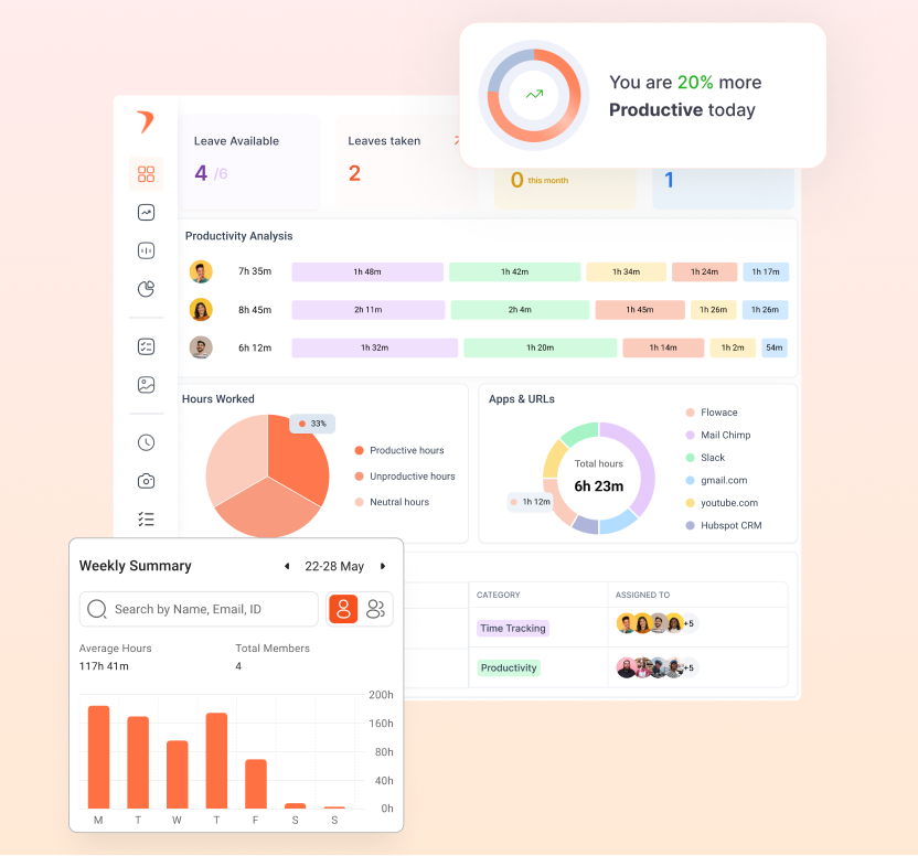
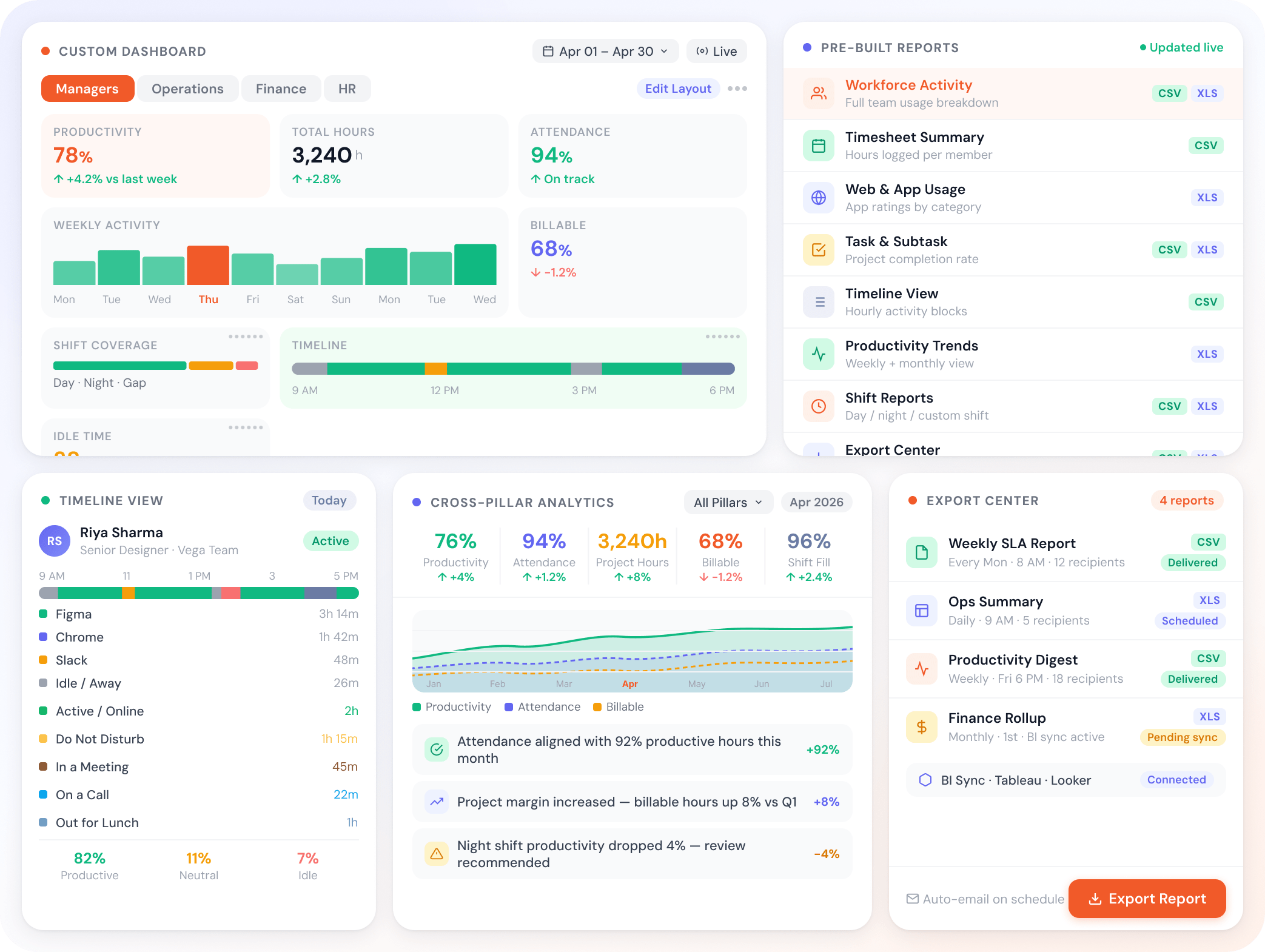
Eight pre-built reports ready for productivity, time, attendance, and projects. Customize dashboards per role. The reports stay current because the platform already tracks the data.
Trusted by teams at
A reporting layer tuned for the real questions managers ask each week.
Eight reports, ready out of the box.
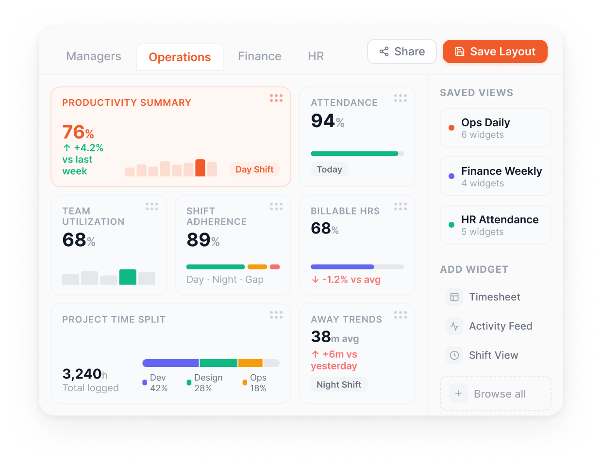
Widgets per role, not per platform.
Cut the data the way your business runs.
Same data, every angle.
CSV or Excel, no enterprise tier required.
Everything you need to surface the right view to the right person, at the right cadence, in the right format. Pre-built for the common patterns, configurable for everything else.
Add, remove, and reposition widgets to build the dashboard your role actually needs.
A reporting layer your operations team won't outgrow.
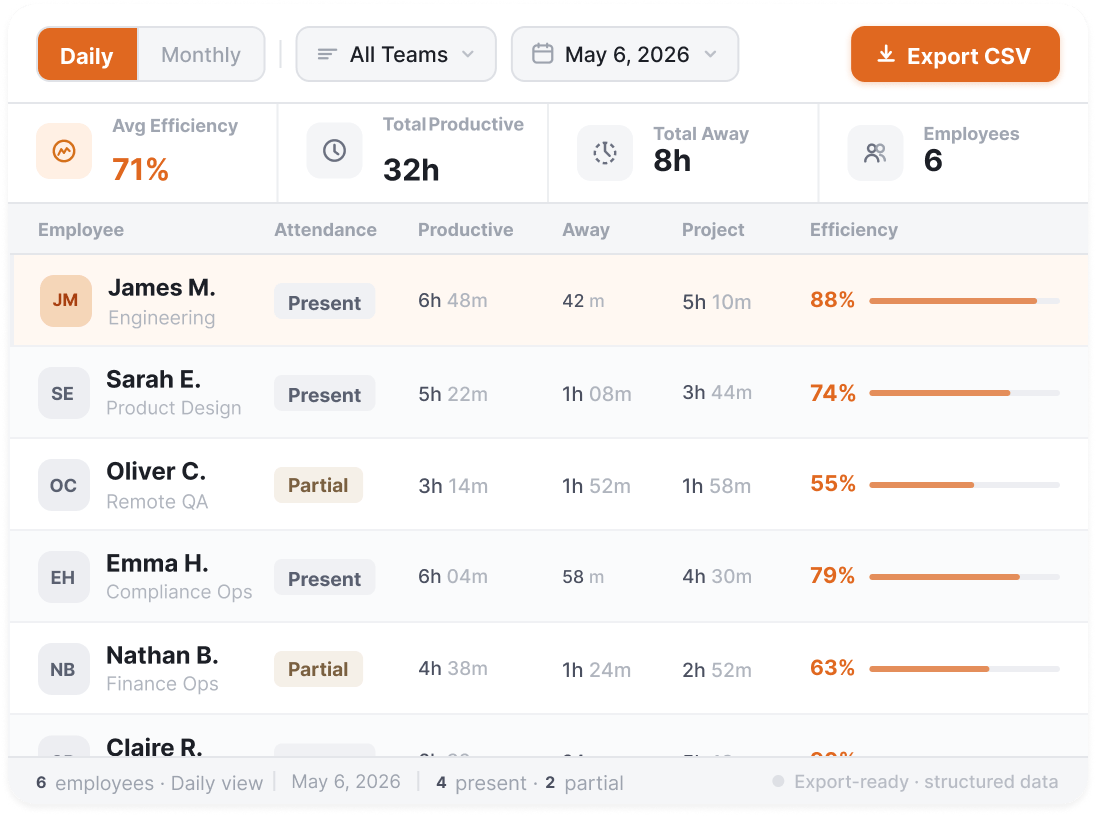
Daily and monthly view of attendance, productive hours, away time, and project time per member, with CSV export.
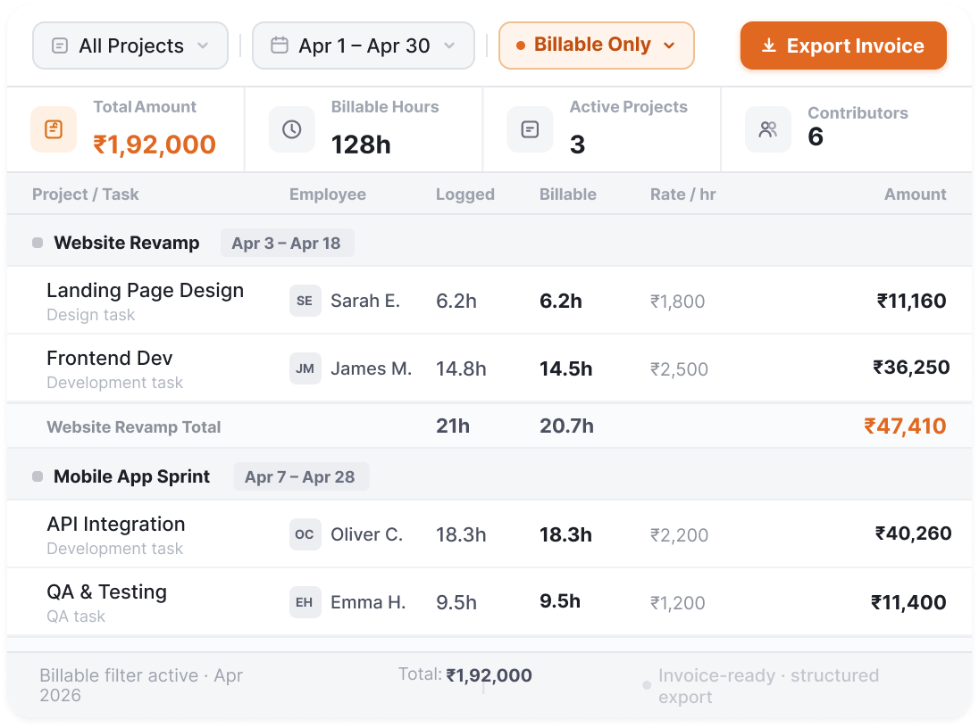
Project-level timesheet rollup for billing reconciliation.
Other Features
Detailed app and website usage export by user, team, and date range.
Task-wise or member-wise project detail report.
Visual timeline of daily activity patterns for any team or member.
All widgets reflect shift-specific data for per-shift comparisons.
Export any report as CSV or Excel. No enterprise tier required.
Built for your industry
BPO, healthcare RCM, IT services, and KPO ops all send reports out to clients as part of their operating model. Legal keeps reports inside the firm. The format, cadence, and consumer change accordingly
What this industry watches for
RCM ops lead + client billing director
Denials by encounter type, coder throughput by shift, payer AR aging, one view you run on and clients expect.
What this industry watches for
Engagement manager + client stakeholder
Delivery managers get the ops view; clients get the progress view, from the same data.
What this industry watches for
Lead + senior manager
WIP aging, utilisation against seasonal targets, and pipeline status, surfaced before the critical moment.
What this industry watches for
Managing partner + finance director
Clients see what they're billed; partners see what it costs to get there.
What this industry watches for
Client success lead + ops director
SLA by LOB, productive hours against contracted FTE, QA by campaign, the MBR pack, straight from ops data.
App and website tracking, productivity ratings, dashboards. See where every hour of work actually goes.
Read moreProject hierarchy, billable hours, automatic timesheets. Track claims, matters, sprints, or cases.
Read moreSilent or interactive monitoring per team. 1-second activity logs. Monitor work without losing employee trust.
Read moreAttendance, shifts, leaves, expenses, and approvals. Run workforce ops from one place.
Read more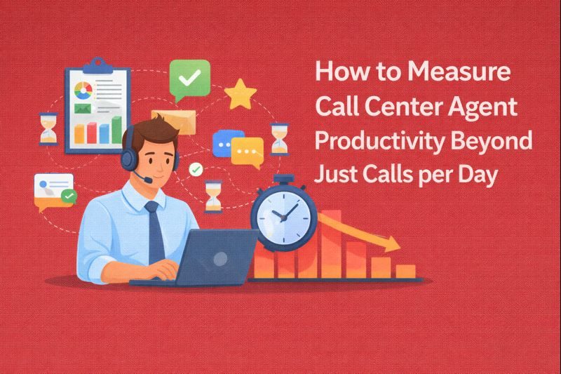
Key Takeaways: Calls per day is an outdated productivity metric. It measures activity, not impact, and fails to reflect the complexity of modern call…
Read more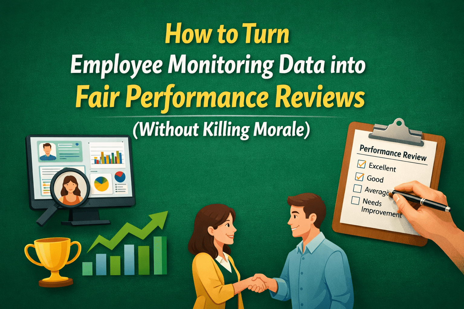
Key Takeaways: Employee monitoring data is a signal, not a verdict: Logs and metrics provide scale and consistency, but they never explain intent, complexity,…
Read more
Timedoctor vs Flowace A thorough comparison of Flowace and Time Doctor should take into account a number of variables, including user reviews, cost, productivity boosts, software features, and the advantages and disadvantages of each program. Time Doctor Software Time Doctor is renowned for its robust tracking capabilities, offering detailed insights into how time…
Read moreDon't let efficiency slip away. Discover game-changing tips and tools to keep your team productive and thriving!
Book a Demo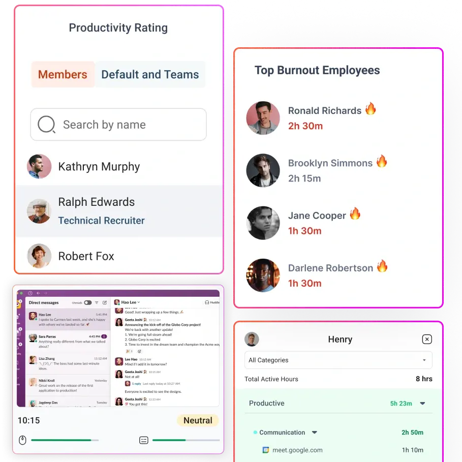
Discover employee monitoring that's smart, ethical, and productivity-focused. Build trust while boosting team performance!
Book a Demo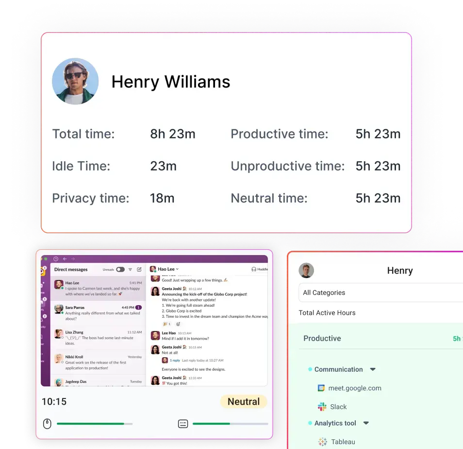
Take control of every second. Discover seamless time-tracking solutions to boost efficiency and get more done!
Book a DemoSay goodbye to manual tracking. Simplify attendance management with smart, automated solutions your team will love!
Book a Demo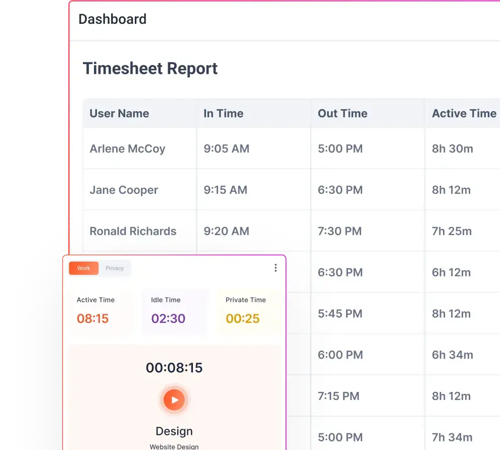
Master app and website insights effortlessly. Unleash smarter tracking and watch productivity skyrocket!
Book a Demo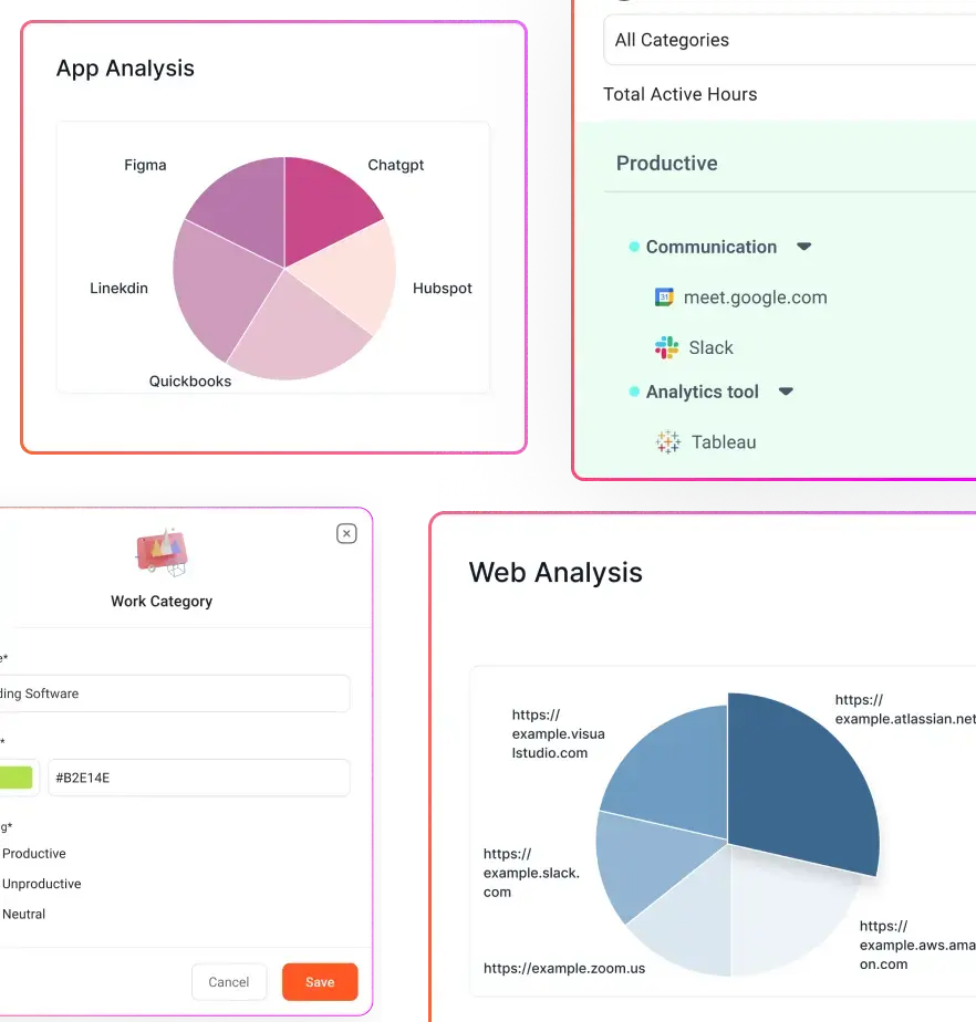
Monitor workflows discreetly and ethically. Get the data you need to enhance productivity—no disruptions, just results!
Book a DemoTame the hustle with smart tracking and seamless workflow solutions. Boost productivity without the headaches!
Book a Demo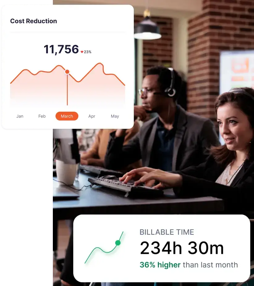
Supercharge your IT team with powerful tracking tools. Boost efficiency and keep projects on track with ease!
Book a Demo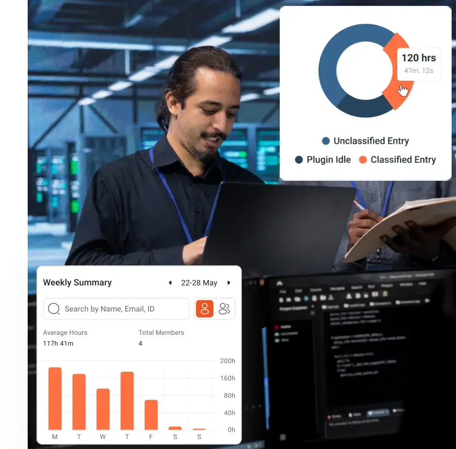
Optimize your accounting processes with smart tools. Boost accuracy, streamline workflows, and save time—effortlessly!
Book a Demo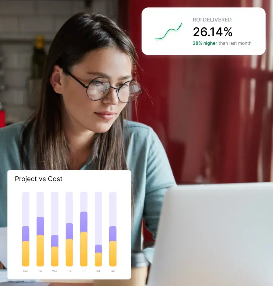
Streamline recruitment and boost team efficiency with smart tracking tools. Hire better, faster, and smarter!
Book a Demo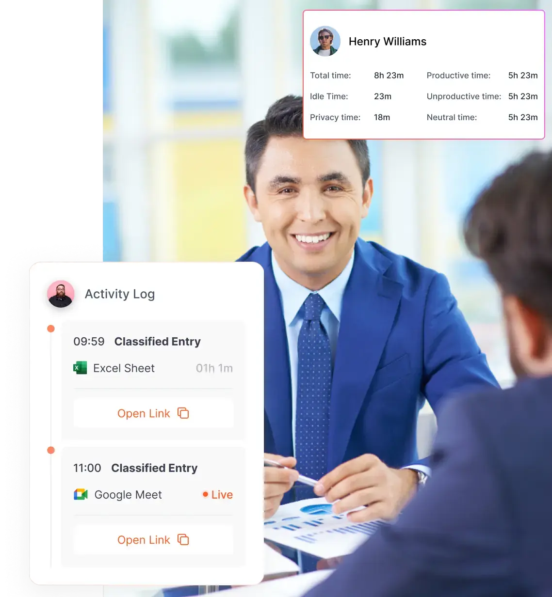
Streamline your legal processes with smart tracking tools. Improve efficiency and keep cases moving forward—smoothly!
Book a Demo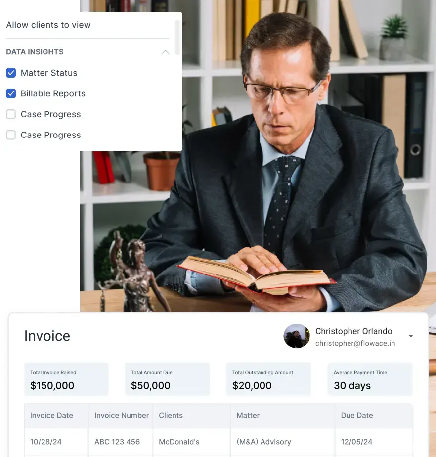
Before you go, check out how Flowace boosts productivity like no other tool. Discover how we can help your team succeed.
Book a Demo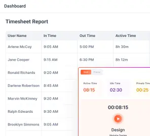

Experience seamless time tracking and productivity enhancement like never before. Join the Flowace revolution and unlock your full potential. Start your journey to success today!”