Key Takeaways:
- A productivity scorecard replaces guesswork with evidence. Instead of relying on subjective impressions, you use a structured set of metrics to see how work actually gets done, where time goes, and whether goals are being met.
- The best scorecards balance output, quality, time, and well-being. Tracking volume alone is misleading. True productivity comes from pairing output metrics with quality indicators, utilization, focus time, and engagement signals.
- Not all productivity metrics are created equal. Vanity metrics like hours online or emails sent rarely drive outcomes. Effective KPIs align tightly with business goals and reflect real progress, not just activity.
- Utilization and resource metrics prevent burnout and waste. Metrics like utilization rate, planned vs. actual hours, and budget variance help you spot over-allocation early and identify underused capacity before it becomes a morale or cost problem.
- Focus time matters as much as effort. When meetings crowd out deep work, productivity drops even if people are “busy.” Measuring focus time and meeting ratios reveals whether your environment supports meaningful work.
- Scorecards fail when they feel like surveillance. Metrics used secretly or punitively erode trust. Transparency, context, and clear intent are what separate healthy performance management from micromanagement.
- One-size-fits-all metrics don’t work. Productivity looks different across roles. Tailoring scorecards by function leads to more accurate insights and higher buy-in.
- Spreadsheets break down as complexity grows. Manual scorecards are slow, error-prone, and hard to scale. Automated dashboards provide real-time visibility, fewer errors, and far less admin overhead.
- Dashboards turn metrics into action. Live dashboards make trends visible quickly, support better decisions, and allow you to intervene early rather than reacting after performance slips.
- The goal is improvement, not control. A well-designed productivity scorecard is a collaboration tool. When used consistently and thoughtfully, it helps you improve systems, support your team, and drive sustainable performance.
An employee productivity scorecard helps managers focus on the right measures to boost performance. Unlike subjective impressions, a scorecard collects employee productivity metrics into a clear report or dashboard. It shows you exactly how much work is getting done, where time is going, and whether goals are being hit.
In this article, we’ll explain what a productivity scorecard is, which KPIs to include, and how to build one step-by-step. You’ll also see comparison tables and practices for using scorecards without hurting morale.
What Is an Employee Productivity Scorecard?
An employee productivity scorecard is a structured report (often a spreadsheet or dashboard) that tracks key performance indicators for your team. It aligns your team’s daily activities with higher-level goals.
A good scorecard includes both output metrics (what work is done) and input metrics (how resources were used). For example, rather than only tracking hours, include tasks completed, quality ratings, and even engagement scores. Managers should aim for a cascade of metrics: high-level strategic targets down to individual activities. In practice, that means translating company goals into team goals and then into day-to-day metrics.
Key Employee Productivity Scorecard Metrics to Measure
If you want indicators that truly reflect performance without being too easy or too punitive, choosing the right metrics is crucial. Here we focus on a handful of productivity KPIs for managers that tie directly to your goals:
Time and Utilization Metrics
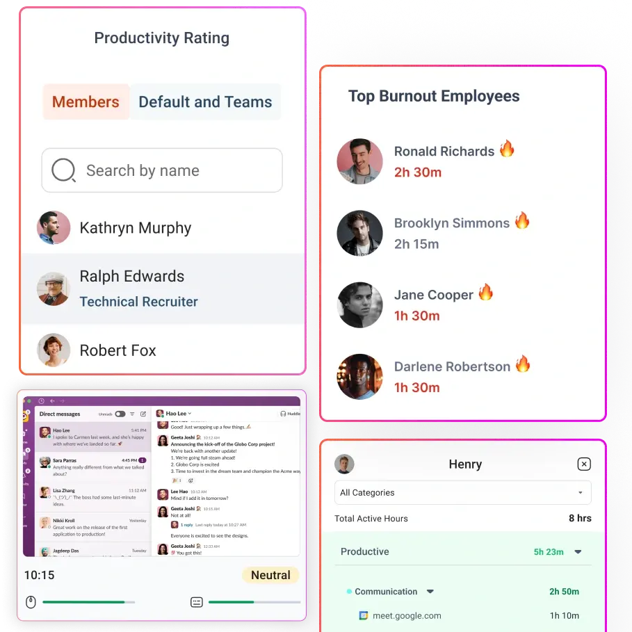
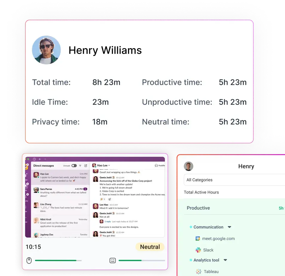
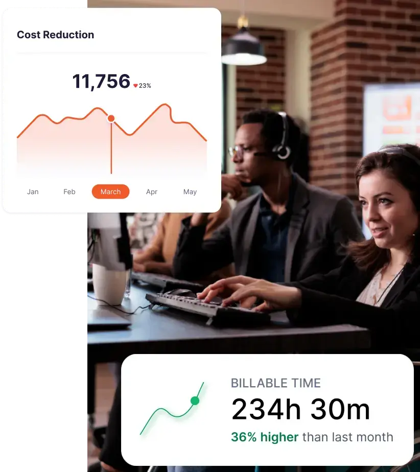
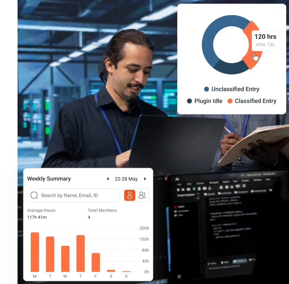
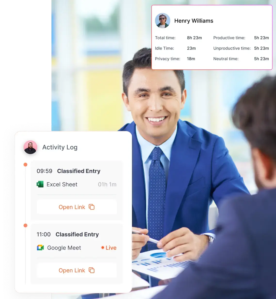
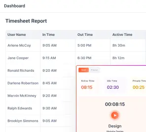
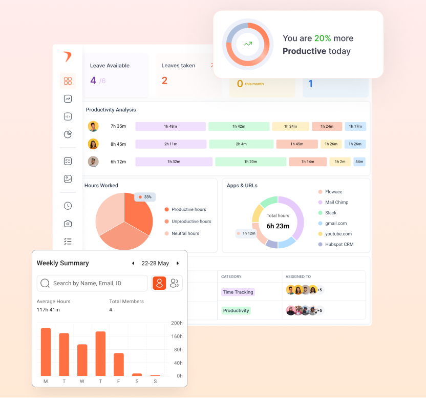
Measuring the quality of your team’s work starts with understanding the split between active hours and idle time, or by looking at a billable utilization rate (billable hours divided by total available hours). Utilization shows what percentage of scheduled time turns into real, productive output. When you track it consistently, you can spot early signs of burnout long before they show up in missed deadlines or attrition.
Task/Output Metrics
You also need a grounded answer to another core question: how much work is actually getting done? That looks different depending on the nature of your team. For delivery or operations roles, it might be tasks completed per day or average handling time. For engineering teams, it could be stories delivered per sprint, features shipped, or meaningful code commits. The exact formula will vary, but the principle stays the same: measure output in a way that reflects real progress, not just activity.
The trap to avoid is counting volume without quality. A high task count means very little if those tasks come back as rework, defects, or client escalations. True productivity balances speed with outcomes. That means pairing output metrics with signals like defect rates, reopens, client feedback, or review cycles so you can distinguish momentum from churn.
Quality and Outcome Metrics
Speed alone is a poor proxy for productivity. What matters is whether the work holds up once it leaves the system. Which means you need quality signals alongside output. Metrics like customer satisfaction scores, error rates, rework frequency, or ticket reopen rates tell you whether your team’s work actually meets the bar. Without them, high throughput can hide fragile delivery and downstream cost.
Focus and Engagement Metrics:
The most important productivity signals shows you whether people actually have the space to do meaningful work. Metrics like focus time (hours of uninterrupted work) and meeting ratio (time spent in meetings versus deep work) reveal how well your environment supports concentration. When meetings crowd out focus, delivery slows even if effort stays high. Over time, this shows up as longer cycles, lower quality, and frustrated teams.
You should also watch engagement and well-being indicators such as employee engagement scores or absence rates. These are not “soft” metrics in practice. Gallup estimates that fully engaged teams could lift productivity by roughly 9 percent of global GDP. On the flip side, low morale and disengagement have a real cost. Heavy-handed monitoring, for example, has been linked to higher quit rates, with a meaningful share of employees leaving roles where they feel constantly surveilled.
Resource Utilization Metrics:
Metrics like resource utilization percentage (planned hours versus actual hours) and budget variance (budgeted time versus time spent) help you see whether your plans match reality. They quickly surface two common problems: people who are stretched too thin and people whose capacity is being quietly wasted.
For operations leaders, project managers, and founders, this visibility replaces guesswork with evidence. You can spot over-allocation before it turns into burnout, and underutilization before it becomes a morale or cost issue. For HR teams, these metrics provide a fairer way to explain staffing decisions and workload changes without relying on subjective impressions.
When tracked consistently across remote, hybrid, and on-site teams, resource utilization metrics cut through spreadsheet chaos and disconnected reports. They give you a shared view of where time and effort are going, making it easier to balance workloads.
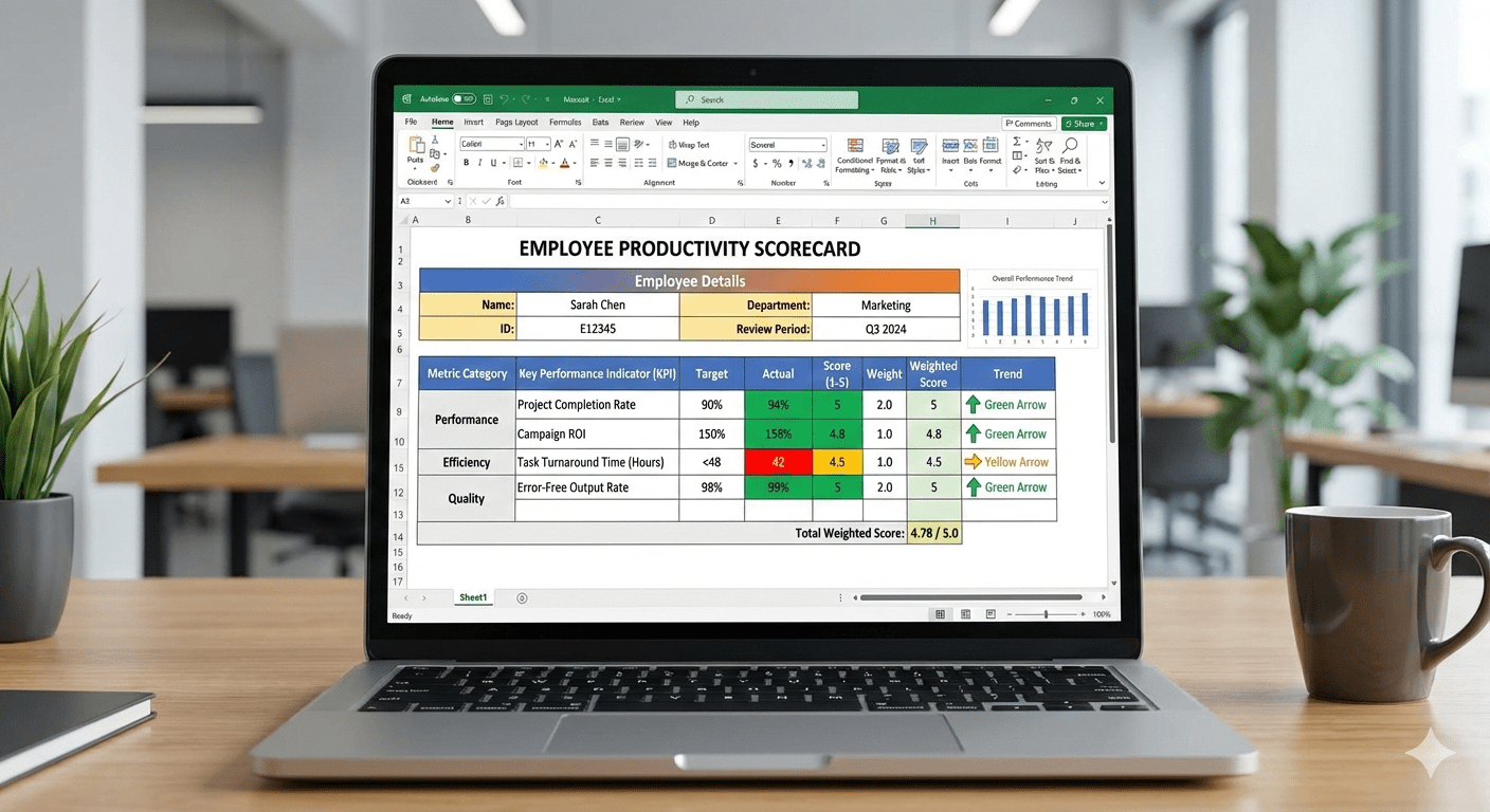
Employee Productivity Scorecard Template
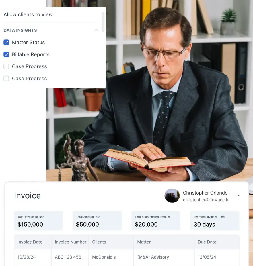
Below is an example table template for an employee productivity scorecard. You can copy this into Excel or Google Sheets and customize the metrics/targets for your team. In each row, include the metric name, a brief description, how it’s calculated (or data source), and the target or benchmark.
| Metric | What It Measures | Calculation/Example | Target |
| Tasks Completed | Volume of work items finished (output) | # of tasks completed in period (e.g. week) | ≥ last period |
| Focus Time % | Uninterrupted work time (deep work) | (Focus hours ÷ total work hours) × 100% | ≥ 60% |
| Utilization Rate | % of time on productive (billable) work | (Billable hours ÷ total scheduled hours) × 100% | 70–80% |
| On-Time Delivery % | % of tasks/projects finished by deadline | (On-time tasks ÷ total tasks) × 100% | ≥ 90% |
| Quality Score | Output quality (e.g. satisfaction rating) | Average rating from client feedback (1–5 stars) | ≥ 4.5/5 |
| Absenteeism Rate | Time lost to unplanned absence (engagement proxy) | (Absent hours ÷ total work hours) × 100% | ≤ 2% |
This sample table shows a mix of output (tasks completed), efficiency (utilization), and quality/morale (satisfaction, absenteeism) metrics. You can expand it with additional columns like “Owner” (who tracks it) or graphs next to values.
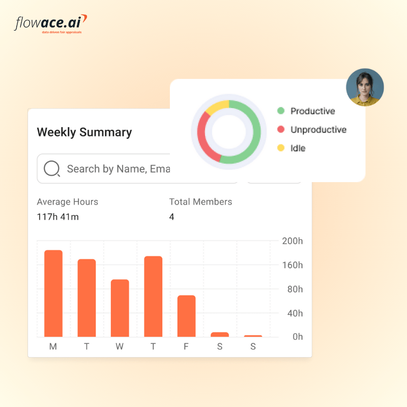
If using a tool like Flowace, much of the data (focus time, utilization, time logs) can be auto-collected and filled in for you.
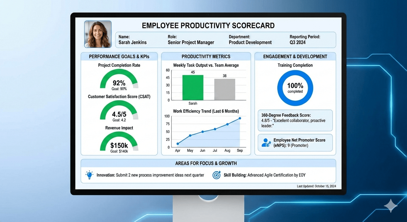
Manual Scorecards vs. Productivity Dashboards
Tracking productivity manually in Excel can work when teams are very small, but it often breaks down as complexity grows. A manual scorecard typically requires someone to gather timesheets, count outputs, and update charts by hand. This is slow and error-prone: A pile of spreadsheet numbers can provide little insight and may even lead to decisions that hurt the company.
In contrast, a productivity dashboard from an employee productivity tool automates the data flow. That is why it is important to invest in a good employee productivity tracker. Once set up, it pulls data from your time tracking and project tools in real-time, updating charts instantly.
For example, consider how these two approaches compare:
| Aspect | Manual Scorecards (Excel) | Productivity Dashboards (e.g. Flowace) |
| Data Updates | Infrequent; manager or admin enters data weekly or monthly. | Automated; real-time data sync from apps (time tracking, CRM). |
| Visibility & Sharing | Static reports (PDF or sheet) emailed or stored on drives. | Interactive, cloud-based view; accessible anytime on web/mobile. |
| Effort Required | High (copying, formatting, manual calculations). | Low after setup (data auto-collected, charts auto-generated). |
| Error Risk | High (typos, outdated formulas). | Lower (data is source-driven; fewer manual steps). |
| Scalability | Limited (hard to track many people or metrics). | Scalable (handles large teams and many metrics easily). |
| Insight & Alerts | Passive (no alerts unless manually built). | Active (can trigger alerts or highlight trends). |
In short, dashboards give you a living picture of productivity. According to McKinsey, visual performance management requires clarity and interactivity. You should see high-level status in 1–3–10 seconds, then drill down if needed. An employee productivity dashboards built on a scorecard do exactly that.
How to Use Employee Productivity Scorecards Without Hurting Team Morale
Tracking metrics can feel like micromanagement if done poorly. The problem is not measurement itself, but intent and execution. When metrics are unclear, overly granular, or used without context, they signal distrust. People assume the data will be used to catch mistakes rather than to improve systems. That anxiety shows up quickly as disengagement, gaming the metrics, or quiet burnout.
To keep the scorecard positive:
- Be Transparent: Explain that the scorecard is for improvement, not surveillance. Share the metrics openly with the team, so they see the full picture. Clearly communicate why you track each KPI and how it benefits the team (for example, helping to identify blockers or celebrate wins).
- Focus on Development: If someone’s numbers are off, discuss obstacles and solutions. For instance, if utilization is low, maybe the team needs better tools or training. Provide support (training, resources, clearer priorities) rather than just penalizing low scores.
- Emphasize Team Goals: Encourage peer support. For example, set team-level targets as well as individual goals. When the group succeeds (say, a project delivered on time), acknowledge everyone’s contribution.
- Avoid Over-Monitoring: Resist the temptation to add metrics every time you want an answer. More is not always better. A focused dashboard with a few key KPIs is more transparent and easier to handle than a spreadsheet with dozens of stats.
- Solicit Feedback: Regularly ask team members how they feel about the metrics. Are any causing stress or gaming? For instance, if employees are stuffing hours in the system to hit a goal, you may need to revise the target or measurement.
Common Mistakes Managers Make While Assessing Employee Productivity Metrics
Even with the best intentions, productivity scorecards can drift off course. The mistakes are rarely dramatic. They usually come from small, reasonable decisions that compound over time. If you want your metrics to guide better decisions rather than create friction, watch for these common traps.
Using irrelevant or poorly chosen metrics
It is tempting to track what is easiest to measure instead of what actually drives outcomes. Vanity metrics like emails sent or hours online look tidy on a dashboard but rarely translate into business value. In some cases, they even encourage counterproductive behavior. Good performance systems start with well-chosen targets that align tightly with strategy. If a metric does not clearly support your goals, it will distort decisions rather than improve them.
Overweighting quantity and ignoring quality
Volume metrics are seductive because they are simple. Tasks per hour, tickets closed, or stories completed can all look impressive until quality slips. When you reward speed alone, errors, rework, and customer dissatisfaction tend to follow. Balance output with quality indicators so productivity reflects sustainable delivery, not just motion.
Applying the same metrics to every role
Productivity is role-specific. What signals strong performance for a consultant may be irrelevant for a developer or support engineer. When you force a one-size-fits-all scorecard across functions, people feel misjudged and disengaged. Tailor metrics to what each role can actually influence, and you will get far more accurate signals and buy-in.
Chasing the wrong benchmarks
Targets that are too low breed complacency. Targets that are unrealistic breed cynicism. Both undermine performance. The most effective benchmarks stretch teams without breaking them. Use historical performance, role context, and industry standards as reference points, and adjust as the business evolves.
Running metrics in secret or using them to micromanage
Nothing erodes trust faster than surprise scorecards or hidden monitoring. When people do not know what is being tracked or how it will be used, they assume the worst. Productivity tracking tools should be transparent and explained upfront. Done well, employee productivity tracking reinforces trust and clarity. Done poorly, it feels like surveillance.
When to Graduate from Spreadsheets to Dashboards
In the beginning, a simple Excel file might suffice for your scorecard. But as teams grow, or as you add more data, it becomes unmanageable. Here are signs it’s time to move on:
- Volume of Data: You have dozens of employees or many projects. A spreadsheet is slow to update and hard to filter once you reach this scale.
- Need for Real-Time Tracking: If you want up-to-the-minute insights (e.g. daily or hourly updates), spreadsheets can’t keep up. Dashboards auto-refresh when new data comes in.
- Complex Calculations or Visuals: As you add more metrics, you might want charts, conditional formatting, or interactive filters. BI dashboards handle this easily, whereas Excel gets clunky.
- Collaboration Needs: Cloud dashboards let managers and team members check the scorecard anytime, anywhere. Updating a shared spreadsheet can be error-prone (version conflicts, forgotten updates).
- Automation Opportunities: Modern tools like Flowace offer integrations and automated reports. For example, Flowace can auto-capture time on apps, categorize activities, and generate team dashboards. When these shortcuts save hours of admin work, it’s worth switching.
If you recognize these signs, plan a smooth transition: map your existing data fields into the dashboard tool, clean up the metrics (dropping any you no longer need), and set up automated data feeds. The effort upfront pays off quickly through saved time and better insights.
At this stage, staying on spreadsheets is not “simple.” It’s expensive. Flowace gives you the same clarity you’re trying to build manually, only faster, cleaner, and at scale.
Key Features of Flowace:
Flowace is an AI-powered employee productivity software that helps you understand how work actually happens. It offers:
- Hands-free, AI-powered time tracking that runs quietly in the background, eliminating manual time entries and spreadsheet updates.
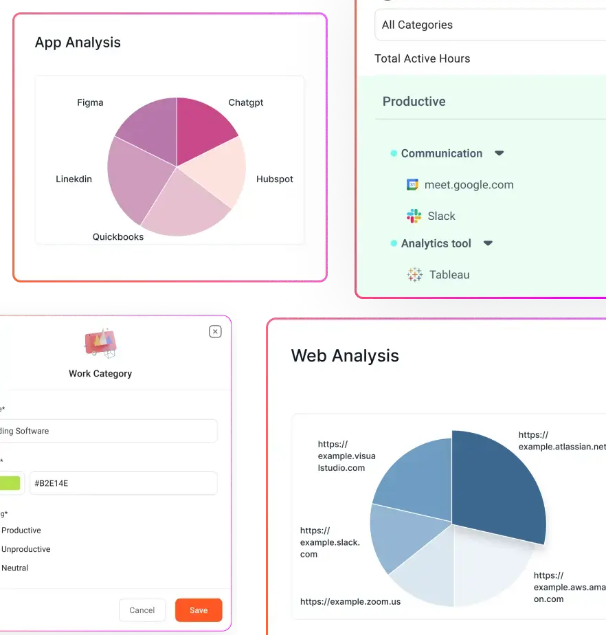
- Automatic capture of work activity across apps, websites, projects, and tasks, so productivity data is always accurate and complete.
- Context-rich productivity insights, breaking time into productive, unproductive, neutral, active, and idle categories, so managers understand how time is used, not just how much.
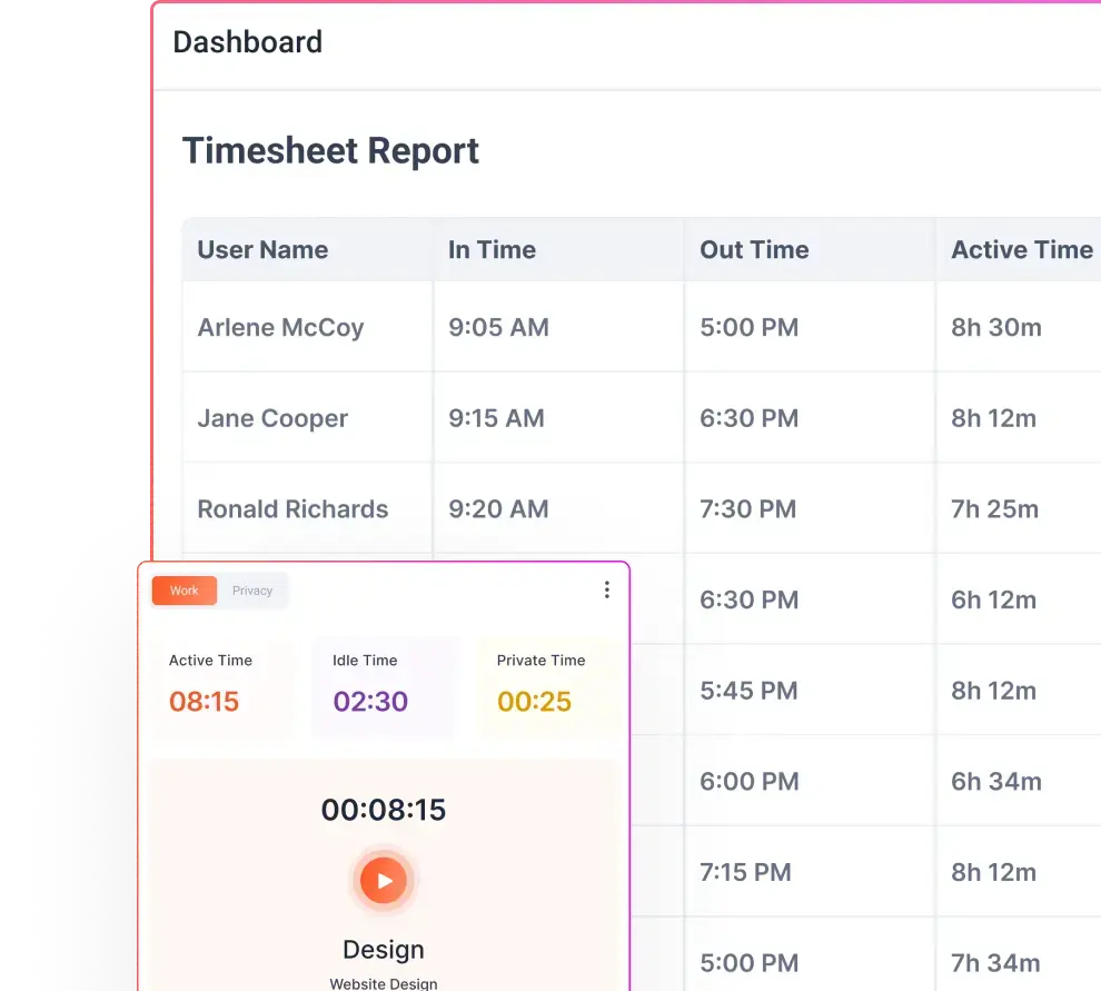
- Automated attendance and timesheets, including login time, logout time, breaks, missing hours, and overtime, reducing payroll errors and admin effort.
- Real-time productivity dashboards for individuals and teams, making trends, bottlenecks, and time leaks visible instantly without manual reporting.
- Work-life balance and burnout indicators, such as overworking hours, idle alerts, and late starts, helping managers prevent burnout before performance drops.
- Project and task-level tracking, enabling accurate billable vs non-billable time measurement and better resource allocation.
- Built-in privacy and transparency controls, including privacy mode and role-based access, ensuring productivity tracking feels fair, not invasive.
- Scalable by design, so the same system works whether you’re managing 10 employees or 1,000, without added complexity.
- Elimination of spreadsheet overhead, turning productivity tracking from a weekly chore into a continuous, reliable source of decision-making data.
The longer productivity stays trapped in spreadsheets, the longer inefficiencies stay invisible. Flowace brings those insights to the surface instantly. If productivity matters to your business, delaying this switch only makes it harder later.
Quick Checklist
Before we conclude, here’s a concise checklist to ensure your productivity scorecard is on track:
- Define clear objectives. Align scorecard KPIs with company and team goals.
- Select balanced metrics. Include output, time, quality, and engagement KPIs. Make sure each is measurable and meaningful.
- Collect baseline data. Know where you stand before setting targets. Use tools (or Flowace) to capture historical data if possible.
- Set SMART targets. Ensure goals are specific, measurable, attainable, relevant, and time-bound.
- Use technology. Automate data collection with tools like Flowace’s AI-powered tracker to minimize manual work.
- Review regularly. Hold weekly or monthly check-ins to analyze the scorecard and make improvements.
- Communicate transparently. Share results with the team, celebrate wins, and discuss improvements positively.
- Avoid pitfalls. Don’t overload the scorecard with metrics or use it as a bludgeon; focus on continuous improvement.
Following this checklist will help you build a scorecard that drives real progress without alienating your team.
Conclusion
A well-designed employee productivity scorecard turns raw data into actionable insight. By tracking the right productivity scorecard metrics, you give yourself and your team a roadmap for improvement. As you refine your scorecard, remember to keep it aligned with goals and treat it as a collaborative tool.
At Flowace, we see many managers succeed by moving from spreadsheets to automated dashboards. Flowace’s time tracking automatically logs work and idle time, producing dashboards for teams and individuals. Our Basic plan starts at just $2.99 per user per month (only $1.99 with annual billing), with no hidden fees. You even get a free 7-day trial to test all features risk-free.
The fastest way to fix productivity gaps is to make them visible. Book a free trial or schedule a free demo with Flowace now.
FAQs:
How is a productivity scorecard different from employee monitoring?
Monitoring focuses on activity. A scorecard focuses on outcomes. While monitoring might track clicks or hours online, a productivity scorecard looks at meaningful signals like delivered work, quality, utilization, and focus time. The goal is improvement and alignment, not surveillance.
How do I avoid micromanaging with productivity metrics?
You avoid micromanagement by being transparent about what you track and why. Share the scorecard openly, explain how metrics are used, and focus discussions on removing obstacles rather than policing behavior. Metrics should guide better systems, not punish individuals.
Should productivity scorecards be shared with employees?
Yes. Scorecards work best when employees can see the same data managers see. Transparency builds trust, encourages ownership, and turns metrics into a shared problem-solving tool instead of a hidden evaluation mechanism.
Can the same productivity scorecard be used for all roles?
No. Productivity is role-specific. Developers, consultants, support teams, and operations staff contribute value in different ways. Scorecards should be customized so people are measured on what they can realistically influence.
What’s a healthy utilization rate for knowledge workers?
For most knowledge roles, a utilization rate between 70 and 80 percent is sustainable. Pushing consistently beyond that often leads to burnout, while much lower rates may indicate misallocation or lack of clarity around priorities.